Connect with us

Infographics

A Visual Guide to Stagflation, Inflation, and Deflation

Published

on

This infographic is available as a poster.

Stagflation

This infographic is available as a poster.

A Visual Guide to Stagflation, Inflation, and Deflation

Today, high inflation and slowing economic growth have contributed to stagflation worries.

As of August 2022, the U.S. inflation rate has risen to 8.3%, above the central bank target of 2%. Yet unlike the last period of stagflation in the 1970s, unemployment—a key ingredient for stagflation—remains low.

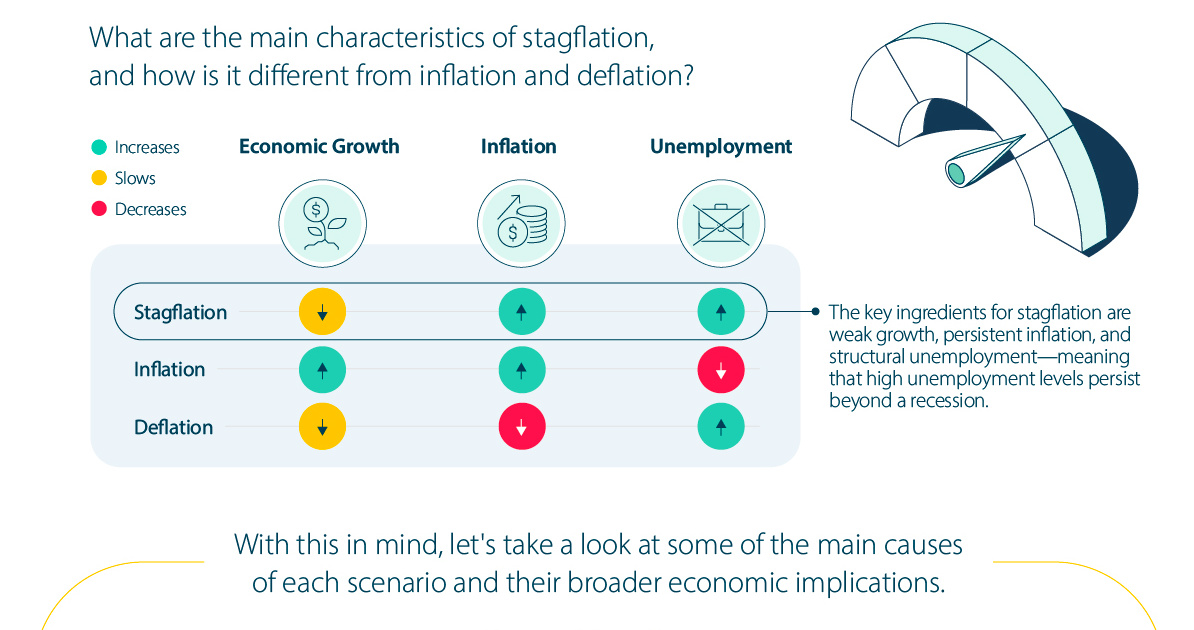
In this infographic from New York Life Investments, we show the key differences between stagflation, inflation, and deflation along with the broader economic implications of each.

Main Features of Inflationary Environments

What are the main characteristics of each inflationary scenario?

 Economic GrowthInflationUnemployment
StagflationSlowsIncreasesIncreases
InflationIncreasesIncreasesDecreases
DeflationSlowsDecreasesIncreases

The key markers of stagflation are weak growth, persistent inflation, and structural unemployment—meaning that high unemployment levels continue beyond a recession.

In a stagflationary scenario, inflation expectations continue to rise each year. This can happen when inflation stays too high for too long, enough for expectations to shift across the economy. This was the case in the U.S. in the 1970s, until the Federal Reserve fought inflation with steep interest rate hikes.

Here’s a closer look at some of the main causes of each scenario and how they’ve historically impacted households and businesses.

1. Stagflation

The term stagflation is the combination of ‘stagnation’ and ‘inflation’.

The primary causes include the expansion of the money supply feeding into higher inflation, as well as supply shocks, which can drag on economic growth.

During periods of stagflation, consumers spend more on items such as food and clothing, while earning less—reducing their purchasing power. Less purchasing power can eventually cause people to buy less, leading to falling corporate revenues, which can ripple across the economy.

Case Study: 1970s Stagflation

The stagflation of the 1970s saw inflation, as measured by the Consumer Price Index, increase from 1% to 14% between 1964 and 1980.

Price pressures, driven by skyrocketing energy prices in the 1970s, contributed to a sharp economic downturn. By 1980, unemployment reached 7.2%.

YearAnnual
Inflation Rate
Unemployment Rate
(December)
Annual
GDP Growth
19641.3%5.0%5.8%
198013.5%7.2%-0.3%

In response, the Federal Reserve raised interest rates as high as 20% in 1981. Soon after, inflation sank to 5% by 1982 and unemployment levels improved.

2. Inflation

Inflation is the rise in the price of goods and services across the economy. Broadly speaking, low and stable inflation is associated with periods of economic growth and low unemployment. It can be driven by rising consumer demand.

The expectation of predictable inflation allows consumers and businesses to prepare for the future, in terms of both their purchases and investments.

Case Study: 1990s-2000s

Over the 1990s and 2000s, the U.S. saw relatively low and stable inflation.

Rapid global population growth, the absence of oil shocks, and expanding global trade contributed to falling costs across industries. Between 1990 and 2007, inflation averaged 2.1% compared to 8.0% during the 1970s as price pressures became less volatile.

YearAnnual
Inflation Rate
Unemployment Rate
(December)
Annual
GDP Growth
19905.4%6.3%1.9%
20072.9%5.0%2.0%

Today, several central banks adhere to a 2% inflation target to ensure prices remain stable and predictable.

3. Deflation

Deflation is the fall in prices of goods and services in the economy.

In many cases, its main causes are demand shortfalls, reduced output, or an excess of supply. For households, spending may stall as consumers wait for prices to fall. In turn, declining prices may lead to a lag in growth for businesses.

Sometimes, deflationary periods raise concerns of slower economic growth. However, supply-driven deflationary periods may be associated with lower prices, raising real incomes and boosting output as exports become more competitive.

Case Study: 1930s Great Depression

Prior to WWII, deflationary episodes were more common than today. One prime example is the Great Depression of the 1930s, when real GDP fell 30% between 1929 and 1933 and unemployment spiked to 25%.

YearAnnual
Inflation Rate
Unemployment Rate
(December)
Annual
GDP Growth
1930-2.7%8.7%-8.5%
1933-5.2%24.9%-1.2%

Tightening monetary policy contributed to this environment. In fact, between 1930 and 1933, the U.S. money supply contracted roughly 30%, while average prices fell by a similar amount.

Historical Asset Class Performance

Which asset classes have historically tended to perform well across different types of inflationary environments?

Average Real Annual Total Returns
(1973-2021)
GoldilocksDisinflationReflationStagflation
U.S. Equities16.1%8.4%14.6%-1.5%
U.S. Treasuries4.3%8.1%-2.0%0.6%
U.S. T-Bills0.8%1.7%0.0%0.4%
Commodities0.4%-5.6%21.0%15.0%
Gold-2.5%1.3%-1.1%22.1%
REITs18.1%3.5%14.0%6.5%

Defensive assets like gold and commodities have historically performed well during stagflationary periods, with average returns of 22.1% and 15.0%, respectively.

Meanwhile, U.S. equities have typically performed well during moderate inflation, or ‘goldilocks’ environments, characterized by falling inflation and rising economic growth.

Both U.S. equities and Treasuries have shown the strongest real returns in deflationary or ‘disinflationary’ periods of slowing growth and inflation, at over 8% returns on average each.

Understanding Different Inflationary Environments

Today’s inflationary period is jarring for investors after an extended period of low and stable inflation. With this in mind, the economy has historically cycled through different types of inflationary periods.

While central banks aim to influence price stability and employment through monetary policy, investors can influence their portfolio by adjusting their asset allocation based on where the inflationary environment may be heading.

Advisor channel footer

Thank you!
Given email address is already subscribed, thank you!
Please provide a valid email address.
Please complete the CAPTCHA.
Oops. Something went wrong. Please try again later.

Continue Reading
Comments

Infographics

Visual Guide: The Three Types of Economic Indicators

From GDP to interest rates, this infographic shows key economic indicators for navigating the massive U.S. economy.

Published

on

View the high resolution version of this infographic. Buy the poster.

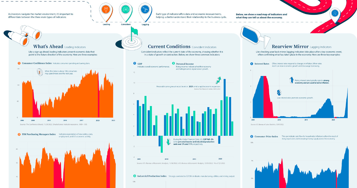
A Visual Guide to Economic Indicators

Economic indicators provide insight on the state of financial markets.

Each type of indicator offers data and economic measurements, helping us better understand their relationship to the business cycle. As investors navigate the market environment, it’s important to differentiate between the three main types of indicators:

  • Leading
  • Coincident
  • Lagging

The above infographic from New York Life Investments shows a road map of indicators and what they can tell us about the economy.

What’s Ahead: Leading Indicators

Leading indicators present economic data that point to the future direction of the economy like a sign up ahead. Here are three examples.

1. Consumer Confidence Index

This key measure indicates consumer spending and saving plans. When the index is above 100, consumers may spend more over the next year. In December, the index jumped to 108 up from 101 in November. This was in part due to lower inflation expectations and improving job prospects.

In the December survey, 48% indicated that the job market remained strong, highlighting the strength of employment opportunities and likely influencing sentiment towards spending in the future.

2. ISM Purchasing Managers Index

The ISM Purchasing Managers Index indicates expectations of new orders, costs, employment, and U.S. economic activity in the manufacturing sector. The following table shows how the index is broken down based on select measures:

IndexNov 2022
Oct 2022Percentage
Point Change
Direction
Trend (Months)
Manufacturing PMI49.050.2-1.2Contracting1
New Orders47.249.2-2.0Contracting3
Employment48.450.0-1.6Contracting1
Prices43.046.6-3.6Decreasing2
Imports46.650.8-4.2Contracting1
Manufacturing SectorContracting1

For instance, in November the index fell into its first month of contraction since May 2020. Falling new orders signal that demand has weakened while contracting employment figures indicate lower output across the sector.

3. S&P 500 Index

The S&P 500 Index indicates the economy’s direction since forward-looking performance is factored into prices. In this way, the S&P 500 Index can represent investor confidence as the index often serves as a proxy for U.S. equity markets. In 2022, returns for the index are roughly -20% year-to-date.

Current Conditions: Coincident Indicators

Coincident indicators reflect the current state of the economy, showing whether it is in a state of growth or contraction.

1. GDP

GDP indicates overall economic performance. Typically it serves as the most comprehensive gauge of the economy since it tracks output across all sectors. In the third quarter of 2022, real U.S. GDP increased 2.9% on an annual basis. That compares to 2.7% for the same period in 2021.

2. Personal Income

Rising incomes indicate a healthier economy and falling incomes signal slower growth. Personal income grew at record levels in 2021 to 7.4% annually amid a rapid economic expansion.

This year, U.S. personal income has grown at a slower pace, at 2.7% on an annual basis as of the third quarter.

3. Industrial Production Index

Strongly correlated to GDP, the industrial production index indicates manufacturing, utilities, and mining output. Below, we show trends in industrial production and how they correspond with GDP and personal income indicators.

DateU.S. GDPPersonal
Income
Industrial
Production
2022*7.3%2.7%4.7%
202110.7%7.4%4.9%
2020-1.5%6.7%-7.0%
20194.1%5.1%-0.7%
20185.4%5.0%3.2%
20174.2%4.6%1.4%
20162.7%2.6%-2.0%
20153.7%4.7%-1.4%
20144.2%5.5%3.0%
20133.6%1.3%2.0%
20124.2%5.1%3.0%
20113.7%5.9%3.2%
20103.9%4.3%5.5%
2009-2.0%-3.2%-11.4%
20082.0%3.8%-3.5%
20074.8%5.6%2.5%
20066.0%7.5%2.3%
20056.7%5.6%3.3%

*As of Q3 2022.

As the above table shows, factory production collapsed following the 2008 financial crisis, a key indicator for the depth of an economic downturn. Meanwhile, personal income sank over -3% while GDP fell -2%.

Despite economic uncertainty in 2022, industrial production remains positive, at a 4.7% growth rate, albeit somewhat slower than 2021 levels.

Rearview Mirror: Lagging Indicators

Like checking your back mirror, lagging indicators take place after a key economic event, often confirming what has taken place in the economy. Here are three key examples.

1. Interest Rates

Often, interest rates respond to changes in inflation. When rates rise it can slow economic growth and discourage borrowing. Rising interest rates typically signal a strong economy and are used to tame inflation. On the other hand, low interest rates promote economic growth.

Following years of record-low interest rates, the Federal Funds rate increased at the fastest rate in decades over 2022, jumping from 0.25% in March to 4.25% in December as inflation accelerated.

2. Consumer Price Index

This inflation measure can indicate cash flow for households. Inflation is often the result of rising input costs and increasing money supply across the economy.

Sometimes, inflation can reach a peak after an expansion has ended as rising demand in an economy has pushed up prices. In November, U.S. inflation reached 7.1% annually amid supply chain disruptions and price pressures across food prices, medical prices, and housing costs.

YearInflation Rate Annual Change
2022*7.1%2.4%
20214.7%3.5%
20201.2%-0.6%
20191.8%-0.6%
20182.4%0.3%
20172.1%0.9%
20161.3%1.1%
20150.1%-1.5%
20141.6%0.2%
20131.5%-0.6%
20122.1%-1.1%
20113.2%1.5%
20101.6%2.0%
2009-0.4%-4.2%
20083.8%1.0%
20072.9%-0.4%
20063.2%-0.2%
20053.4%0.7%

*As of November 2022.

3. Unemployment Rate

The unemployment rate has many spillover effects, impacting consumer spending and in turn retail sales and GDP. Historically, unemployment falls slowly after an economic recovery which is why it’s considered a lagging indicator. When the unemployment rate rises it confirms lagging economic performance.

Overall, 2022 has been characterized by a strong job market, with unemployment levels below historical averages, at 3.7% as of October.

On the Road

To get a more comprehensive picture of the economy, combining a number of indicators is more effective than isolating a few variables. With these tools, investors can gain more perspective on the cyclical nature of the business cycle while keeping a long-term perspective in mind on the road ahead.

Advisor channel footer

Thank you!
Given email address is already subscribed, thank you!
Please provide a valid email address.
Please complete the CAPTCHA.
Oops. Something went wrong. Please try again later.

Continue Reading

Infographics

Europe’s Energy Crisis and the Global Economy

Europe’s energy crisis could last well into 2023. Here’s how the energy shock is causing ripple effects across the broader economy.

Published

on

This infographic is available as a poster.

Europe’s Energy Crisis and the Global Economy

Volatile energy prices are squeezing household costs and business productivity in Europe.

While energy prices have fallen in recent months, several factors could influence price volatility looking ahead:

  • Russia slashing energy supplies
  • Rising winter heating demand
  • Shrinking European storage facilities

In the above infographic from New York Life Investments, we show the potential impacts of Europe’s energy crisis on consumers, businesses, and the wider global economy.

1. Impact on Consumers

Energy plays a central role in overall inflation. Here’s how it factors into the consumption baskets of various countries:

CountryEnergy %
of Inflation
Total Inflation Rate
(Sep 2022)
EnergyFoodAll Items Less Food
and Energy
Germany46%9.9%4.5%1.8%3.6%
Italy42%8.7%3.7%2.2%2.8%
Japan42%3.0%1.3%1.0%0.8%
France29%5.6%1.6%1.6%2.4%
United Kingdom28%8.8%2.5%1.3%5.0%
U.S.17%8.2%1.4%1.0%5.8%
Canada15%6.8%1.0%1.3%4.5%

Source: OECD (Oct 2022). Annual inflation is measured by the Consumer Price Index.

As the above table shows, energy makes up nearly half of consumer price inflation in Germany. In the U.S., it contributes to about one-fifth of overall inflation.

Amid energy supply disruptions, U.S. winter heating costs are projected to rise to the highest level in a decade. As heating costs rise, it could impact consumer spending on discretionary items across the economy, along with other essential household bills.

2. Impact on Business

Natural gas and petroleum are key components in many industries’ energy consumption. As a result, the recent rise in energy prices is adding significant cost pressures to operations.

Below, we show how four primary sectors use energy, by source:

U.S. SectorPetroleumNatural GasRenewablesCoalElectricity
Transportation90%4%5%0%<1%
Industrial34%40%9%4%13%
Residential8%42%7%0%43%
Commerical10%37%3%<1%50%

Source: EIA (Apr 2022). Figures represent end-use sector energy consumption in 2021.

In Europe, soaring energy prices have led to production declines in energy-sensitive industries over recent months. As a ripple effect, European fertilizer production capacity has decreased as much as 70%, crude steel capacity has fallen 10%, and aluminum and zinc production capacity has sunk 50%.

In response, some companies may move production out of Europe to regions with lower energy prices. This occurred in 2010-2014 amid high European energy prices, where companies relocated to the U.S., the Middle East, and North Africa.

3. Impact on the Economy

While the energy crisis is having devastating effects on many countries, some markets like the U.S. are more sheltered from the impact. As seen in the table below, the U.S. produces virtually all of its natural gas. Figures are shown in trillion cubic feet.

YearU.S. Natural Gas
Production
U.S. Natural Gas
Consumption
Net Imports
20213531-4
20203331-3
20193431-2
20183130-1
201727270
201627271
201527271
201426271
201324261
201224262
201123242
201021243

Source: EIA (Sep 2022).

By contrast, Europe imports 80% of its natural gas, primarily from Russia, North Africa, and Norway. Not only that, natural gas imports have increased over the last decade, up from 65% of total supplies in 2010.

Meanwhile, the energy sector is seeing strong returns supported by higher oil and natural gas prices, along with key fuel shortages as Russia constricts supplies to Europe. In November the S&P 500 Energy Index was up 65% year-to-date compared to the broader index, with -17% returns.

Europe’s Energy Crisis: Looking Ahead

Given the complex geopolitical environment, Europe’s energy crisis could last well into 2023, driven by many factors:

  • Rising demand from China post-COVID-19 lockdowns
  • Lower European fuel reserves
  • Inadequate energy infrastructure in the medium-term

The good news is that European government relief has reached €674 billion ($690 billion) to cushion the effect on households and businesses.

However, this has additional challenges as increasing money supply may be an inflationary force.

Amid market volatility, investors can avoid getting caught up in short-term market movements and stay focused on their long-term strategic allocation.

Advisor channel footer

Thank you!
Given email address is already subscribed, thank you!
Please provide a valid email address.
Please complete the CAPTCHA.
Oops. Something went wrong. Please try again later.

Continue Reading

Subscribe

Are you a financial advisor?

Subscribe here to get every update, including when new charts or infographics go live:

Thank you!
Given email address is already subscribed, thank you!
Please provide a valid email address.
Please complete the CAPTCHA.
Oops. Something went wrong. Please try again later.

Social

Popular