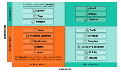

We show the sectors with the lowest exposure to recession risk—and the factors that drive their performance.
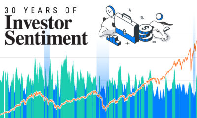

Here's how investor sentiment has shifted over the last three decades, from the Dotcom boom to present-day.
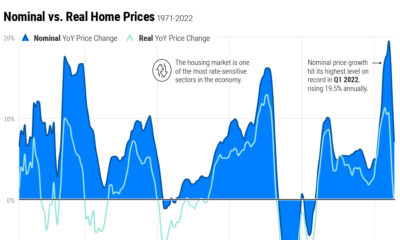

Home price growth has moderated amid rising interest rates and a narrow housing supply. Here's how prices compare to historical trends.
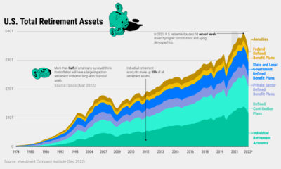

U.S. retirement assets have faced challenging conditions amid market headwinds—but over the last decade these assets have nearly doubled.
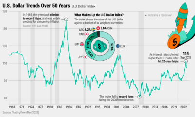

The U.S. dollar hit 20-year highs in 2022. Why is the dollar so strong, and what does it mean for financial markets and investors?
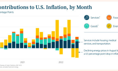

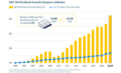
This infographic explores questions on today’s inflationary environment as the economy faces persistent price pressures.
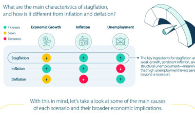

In this infographic, we show the key differences between stagflation, inflation, and deflation and how they impact the economy and investors.
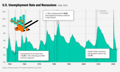

Despite market uncertainty, U.S. unemployment is low, at 3.7%. In this infographic, we show unemployment and recessions since 1948.

This infographic looks at the key fundamentals and market sectors that have been historically resilient during down markets.
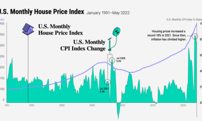

Is there a correlation between housing prices and inflation? In this graphic, we chart their relationship over three decades.