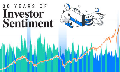
Markets in a Minute
How Closely Related Are Historical Mortgage Rates and Housing Prices?


How to use: Arrows on side of slides navigate between mortgage rate & house price data at the same point in time, and data with a two year house price lag.


This infographic is available as a poster.
Are Historical Mortgage Rates and House Prices Related?
Mortgage rates are rising at their fastest pace in at least 30 years. As mortgage rates climb, it becomes more expensive to finance a home purchase. This leaves many homebuyers with lower budgets. Could house prices drop as a result?
In this Markets in a Minute from New York Life Investments, we explore the relationship between historical mortgage rates and housing prices over the last 30 years. It’s the last in a three-part series on house prices.
Historical Mortgage Rates vs Housing Prices
To compare trends in historical mortgage rates and housing prices over time, we calculated year-over-year percentage changes. We used monthly data spanning from January 1992 to June 2022. Here’s a summary of movements over that timeframe.
| Scenario | # of Months |
|---|---|
| Mortgage Rate Decline, House Price Growth | 193 |
| Mortgage Rate Growth, House Price Growth | 117 |
| Mortgage Rate Decline, House Price Decline | 49 |
| Mortgage Rate Growth, House Price Decline | 6 |
November 2006 has been excluded from the above tally as year-over-year mortgage rate growth was 0.0% at that time.
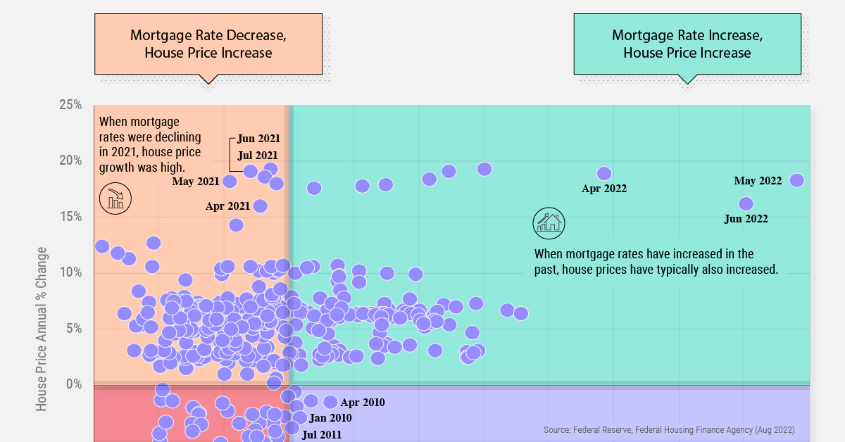
Mortgage rates and house prices have a weak positive correlation of 0.26. This means that when mortgage rates increase, house prices typically also increase. What could be contributing to this trend? Mortgage rate increases are associated with periods when the Federal Reserve is raising its policy rate in response to inflation that is higher than desired. Often, this coincides with strong economic growth, low unemployment, and rising wages, which can all strengthen home prices.
Over the last 30 years, it was quite rare for mortgage rates to rise while house prices simultaneously dropped. This only occurred in the early stages of the Global Financial Crisis and during the recovery.
| Date | Mortgage Rate YoY Change | House Price YoY Change |
|---|---|---|
| Aug 2007 | 0.8% | -0.6% |
| Oct 2007 | 1.1% | -1.9% |
| Jan 2010 | 1.6% | -2.9% |
| Apr 2010 | 6.3% | -1.5% |
| May 2010 | 3.3% | -1.4% |
| Jul 2011 | 0.4% | -3.8% |
While mortgage rates saw some upward movement in the wake of the Global Financial Crisis, it took the housing market longer to recover. In fact, housing prices didn’t see a positive year-over-year change until March 2012.
Is There a Lag Effect?
A change in mortgage rates may not be immediately reflected in housing prices. To test whether there was a lag effect, we also explored the relationship between historical mortgage rates and housing prices two years later.* For instance, we compared the annual percentage change in mortgage rates in 2020 to housing price growth in 2022.
Here’s what the data looked like with this two year lag of housing price growth.
| Scenario | # of Months |
|---|---|
| Mortgage Rate Decline, House Price Growth | 190 |
| Mortgage Rate Growth, House Price Growth | 97 |
| Mortgage Rate Decline, House Price Decline | 37 |
| Mortgage Rate Growth, House Price Decline | 17 |
*We tested for a lag effect using house prices six months later, one year later, two years later, and three years later. The data using house prices 6 months later and three years later revealed no correlation between mortgage rates and housing prices. The data using house prices one year later revealed the same correlation as using house price data from two years later. November 2006 has been excluded from the above tally as year-over-year mortgage rate growth was 0.0% at that time.
The pattern was similar, albeit with a slightly negative correlation of -0.15. In other words, mortgage rates and house prices tended to move in opposite directions.
For example, this occurred in 2020 when mortgage rates were dropping and the Federal Reserve had not yet begun to raise its policy rate. Two years later in 2022, house prices were seeing record high levels of growth amid strong demand and low supply.
Compared to our first analysis above, there were also more instances where mortgage rates increased and house prices decreased. This activity all related to mortgage rates rising from 2005-2007 amid inflation concerns, with housing prices crashing in the following years due to subprime mortgages and the Global Financial Crisis.
Historical Mortgage Rates: One Piece of the Puzzle
Could the current rising mortgage rates cause housing prices to drop? In the last 30 years, there is no historical precedent for this apart from the Global Financial Crisis. Of course, subprime mortgages—mortgages to people with impaired credit scores—contributed to the housing market collapse at that time.
While researchers believe it’s unlikely housing price growth will turn negative, the pace of growth is slowing down. We can see this in the below chart showing trends between historical mortgage rates and housing prices over time.
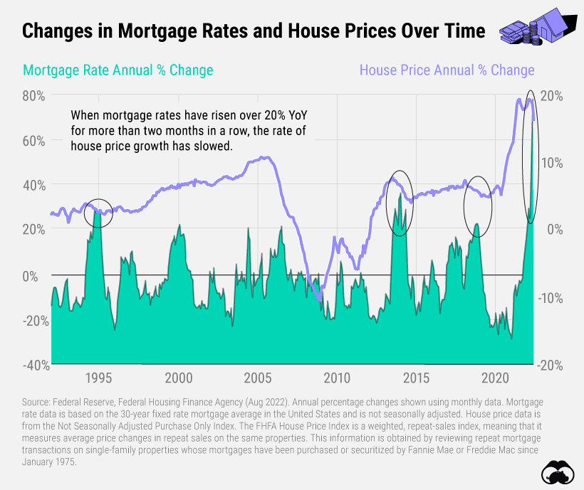
Historically, a slowdown in house price growth has occurred when mortgage rates increase rapidly. Since 1992, there have been four instances when mortgage rates rose over 20% year-over-year for more than two months in a row. Each of them has been accompanied by a deceleration in house price growth.
| Time Period | House Price YoY Change at Start | House Price YoY Change at End |
|---|---|---|
| Sep 1994-Feb 1995 | 3.1% | 2.9% |
| Aug 2013-May 2014 | 7.2% | 4.7% |
| Sep 2018-Dec 2018 | 5.8% | 5.5% |
| Jan 2022-Jun 2022 | 18.4% | 16.2% |
Note: House price data only available until June 2022 and does not reflect any fluctuations since that time.
In the first half of 2022, house price growth slowed by over two percentage points. However, it’s important to keep in mind that while mortgage rates and affordability can play a role in the housing market, there are other factors at play. The current market is buoyed by high demand as millennials reach their prime home buying years, coupled with a housing supply shortage.


Markets in a Minute
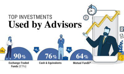
The Top 5 Reasons Clients Fire a Financial Advisor
Firing an advisor is often driven by more than cost and performance factors. Here are the top reasons clients ‘break up’ with their advisors.

The Top 5 Reasons Clients Fire a Financial Advisor
What drives investors to fire a financial advisor?
From saving for a down payment to planning for retirement, clients turn to advisors to guide them through life’s complex financial decisions. However, many of the key reasons for firing a financial advisor stem from emotional factors, and go beyond purely financial motivations.
We partnered with Morningstar to show the top reasons clients fire an advisor to provide insight on what’s driving investor behavior.
What Drives Firing Decisions?
Here are the top reasons clients terminated their advisor, based on a survey of 184 respondents:
| Reason for Firing | % of Respondents Citing This Reason | Type of Motivation |
|---|---|---|
| Quality of financial advice and services | 32% | Emotion-based reason |
| Quality of relationship | 21% | Emotion-based reason |
| Cost of services | 17% | Financial-based reason |
| Return performance | 11% | Financial-based reason |
| Comfort handling financial issues on their own | 10% | Emotion-based reason |
Numbers may not total 100 due to rounding. Respondents could select more than one answer.
Numbers may not total 100 due to rounding. Respondents could select more than one answer.
While firing an advisor is rare, many of the primary drivers behind firing decisions are also emotionally driven.
Often, advisors were fired due to the quality of the relationship. In many cases, this was due to an advisor not dedicating enough time to fully grasp their personal financial goals. Additionally, wealthier, and more financially literate clients are more likely to fire their advisors—highlighting the importance of understanding the client.
Key Takeaways
Given these driving factors, here are five ways that advisors can build a lasting relationship through recognizing their clients’ emotional needs:
- Understand your clients’ deeper goals
- Reach out proactively
- Act as a financial coach
- Keep clients updated
- Conduct goal-setting exercises on a regular basis
By communicating their value and setting expectations early, advisors can help prevent setbacks in their practice by adeptly recognizing the emotional motivators of their clients.
Markets in a Minute
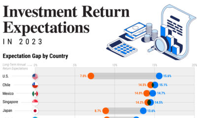
The Top 5 Reasons Clients Hire a Financial Advisor
Here are the most common drivers for hiring a financial advisor, revealing that investor motivations go beyond just financial factors.

The Top 5 Reasons Clients Hire a Financial Advisor
What drives investors to hire a financial advisor?
From saving for a down payment to planning for retirement, clients turn to advisors to guide them through life’s complex financial decisions. However, many of the key reasons for hiring a financial advisor stem from emotional factors, and go beyond purely financial motivations.
We partnered with Morningstar to show the top reasons clients hire a financial advisor to provide insight on what’s driving investor behavior.
What Drives Hiring Decisions?
Here are the most common reasons for hiring an advisor, based on a survey of 312 respondents.
| Reason for Hiring | % of Respondents Citing This Reason | Type of Motivation |
|---|---|---|
| Specific goals or needs | 32% | Financial-based reason |
| Discomfort handling finances | 32% | Emotion-based reason |
| Behavioral coaching | 17% | Emotion-based reason |
| Recommended by family or friends | 12% | Emotion-based reason |
| Quality of relationship | 10% | Emotion-based reason |
Numbers may not total 100 due to rounding. Respondents could select more than one answer.
While financial factors played an important role in hiring decisions, emotional reasons made up the largest share of total responses.
This illustrates that clients place a high degree of importance on reaching specific goals or needs, and how an advisor communicates with them. Furthermore, clients seek out advisors for behavioral coaching to help them make informed decisions while staying the course.
Key Takeaways
With this in mind, here are five ways advisors can provide value to their clients and grow their practice:
- Address clients’ emotional needs early on
- Demonstrate how you can offer support
- Use ordinary language
- Provide education to help clients stay on track
- Acknowledge that these are issues we all face
By addressing emotional factors, advisors can more effectively help clients’ navigate intricate financial decisions and avoid common behavioral mistakes.

The Top 5 Reasons Clients Fire a Financial Advisor

The Top 5 Reasons Clients Hire a Financial Advisor

Visualizing the Growth of $100, by Asset Class

How Small Investments Make a Big Impact Over Time

What Were the Top Performing Investment Themes of 2023?
-
 Infographics2 years ago
The Top Investment Quotes Every Investor Should Know
-
 Markets in a Minute2 years ago
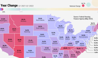
Mapped: The Growth in U.S. House Prices by State
-
 Infographics2 years ago
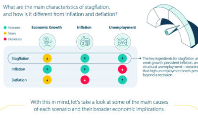
A Visual Guide to Stagflation, Inflation, and Deflation
-
 Markets in a Minute1 year ago
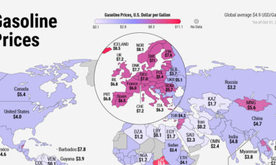
Mapped: Global Energy Prices, by Country in 2022
-
 Markets in a Minute2 years ago
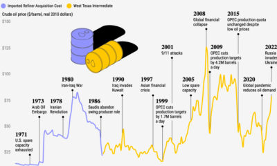
Visualizing Historical Oil Prices (1968-2022)
-
 Infographics1 year ago
Visual Guide: The Three Types of Economic Indicators
-

 Markets in a Minute2 years ago
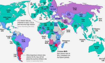
Mapped: Global Macroeconomic Risk, by Country in 2022
-
 Markets in a Minute2 years ago
Mapped: Interest Rates by Country in 2022