Markets in a Minute
How Asset Classes Have Performed After Interest Rate Hikes
How to use: Arrows on side navigate between annualized return and annualized risk


This infographic is available as a poster.
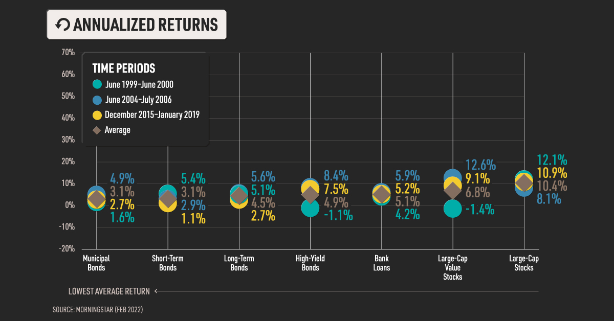
Asset Class Performance After Interest Rate Hikes
For the first time in more than three years, the U.S. Federal Reserve has raised the target interest rate. It’s an incremental step towards fighting inflation that is at its highest level in 40 years. Not only that, the Federal Reserve is predicting six more interest rate hikes before the end of 2022.
What does this mean for investors and their portfolios? In this Markets in a Minute from New York Life Investments, we show the risk and return of select asset classes during the last three periods of interest rate hikes.
Historical Returns After Interest Rate Hikes
We looked at annualized returns, which measures the return investors would have earned in a year if returns were compounded. Here is how they break down, sorted from lowest average return to highest average return.
| Asset Class | Jun. 1999– Jun. 2000 | Jun. 2004– Jul. 2006 | Dec. 2015– Jan. 2019 | Average |
|---|---|---|---|---|
| Municipal Bonds | 1.6% | 4.9% | 2.7% | 3.1% |
| Short-Term Bonds | 5.4% | 2.9% | 1.1% | 3.1% |
| Long-Term Bonds | 5.1% | 5.6% | 2.7% | 4.5% |
| High-Yield Bonds | -1.1% | 8.4% | 7.5% | 4.9% |
| Bank Loans | 4.2% | 5.9% | 5.2% | 5.1% |
| Large-Cap Value Stocks | -1.4% | 12.6% | 9.1% | 6.8% |
| Large-Cap Stocks | 12.1% | 8.1% | 10.9% | 10.4% |
| REITs | -0.6% | 24.4% | 8.4% | 10.8% |
| Gold | 6.7% | 24.5% | 7.2% | 12.8% |
| Large-Cap Growth Stocks | 24.7% | 3.8% | 12.3% | 13.6% |
| Ex-U.S. Developed Country Stocks | 21.6% | 21.5% | 5.5% | 16.2% |
| Global Commodities | 63.1% | 14.3% | 0.3% | 25.9% |
Based on time periods from the first Federal Reserve rate hike until one month after the last rate hike, which, on average, is when the effective federal funds rate tends to stabilize.
Among fixed income investments, floating rate bank loans had the highest average return. These loans pay a spread over a specified reference rate, with the rate resetting every 30, 60, or 90 days based on the prevailing interest rate. Because the rate “floats”, payments can rise as interest rates rise. However, bank loans are made to non-investment-grade companies, which are considered to be higher risk.
Ex-U.S. developed country stocks had the highest average return of the select stock types. International stocks may be a hedge against interest rate hikes because, compared to U.S. large cap stocks, they are more heavily concentrated in cyclical sectors like materials, industrials, and financials. These sectors tend to perform well when the economy is growing and rates are rising.
Within the alternatives realm, global commodities were the strongest on average. The average is skewed upward because of the outsized return earned in the 1999–2000 period. Brazil, Russia, India, and China were rapidly industrializing, which required an enormous amount of raw materials, food, and energy commodities. The boom lasted for more than 10 years in what is known as a commodity super cycle.
The Other Side of the Coin: Risk
We also measured asset class risk using standard deviation, which looks at the amount of variation in returns. Here is how it breaks down over the last three periods of interest rate hikes, organized from lowest to highest average risk.
| Asset Class | Jun. 1999– Jun. 2000 | Jun. 2004– Jul. 2006 | Dec. 2015– Jan. 2019 | Average |
|---|---|---|---|---|
| Short-Term Bonds | 0.2% | 0.4% | 0.2% | 0.3% |
| Bank Loans | 1.9% | 0.7% | 3.0% | 1.9% |
| Municipal Bonds | 4.4% | 2.7% | 3.3% | 3.5% |
| High-Yield Bonds | 3.9% | 4.0% | 5.4% | 4.4% |
| Long-Term Bonds | 5.5% | 7.2% | 9.4% | 7.4% |
| Large Cap Stocks | 16.0% | 7.4% | 11.5% | 11.6% |
| Large-Cap Value Stocks | 16.3% | 7.2% | 11.8% | 11.8% |
| Ex-U.S. Developed Country Stocks | 14.4% | 10.6% | 11.8% | 12.2% |
| REITs | 10.9% | 13.6% | 13.8% | 12.7% |
| Large-Cap Growth Stocks | 19.4% | 8.0% | 12.2% | 13.2% |
| Gold | 20.0% | 15.6% | 12.9% | 16.2% |
| Global Commodities | 15.1% | 23.9% | 16.7% | 18.6% |
Short-term bonds had the lowest risk, and were 25 times less risky than long-term bonds on average. Bonds with shorter maturities have a lower duration—which measures the sensitivity of a bond’s price to interest rate changes—than long-term bonds. This means their prices do not drop as much when rates rise.
Among the select stocks, large cap stocks and their value style counterparts had the lowest average risk. Value stocks tend to be established companies with actual earnings, meaning they can raise prices to boost profit margins during interest rate hikes and rising inflation.
Within the alternatives realm, real estate investment trusts (REITs) had the lowest risk. Rising rates generally means the economy is growing, which translates into greater demand for real estate and the ability to charge higher rent. Interestingly, a 40-year analysis by Nareit found that REITs performed well during both high inflation and low inflation periods. This means they are less subject to prediction risk, or the risk that investors correctly predict high-inflation periods. In contrast, commodities performed well during high inflation periods but performed poorly during low inflation.
Interest Rate Hikes and Your Investments
In addition to considering the historical returns of asset classes during interest rate hikes, investors may also consider the potential risk involved.
We looked at performance within the broader categories of fixed income, stocks, and alternatives. Historically, bank loans, ex-U.S. developed country stocks, and global commodities have offered the highest average returns. However, short-term bonds, large cap stocks, and REITs had the lowest average risk.
The current macroeconomic environment, such as the Russia-Ukraine conflict, may also play a role in performance. Will history repeat itself, or will different asset classes outperform during the interest rate hikes to come?


Markets in a Minute
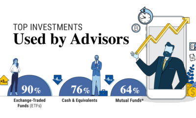
The Top 5 Reasons Clients Fire a Financial Advisor
Firing an advisor is often driven by more than cost and performance factors. Here are the top reasons clients ‘break up’ with their advisors.

The Top 5 Reasons Clients Fire a Financial Advisor
What drives investors to fire a financial advisor?
From saving for a down payment to planning for retirement, clients turn to advisors to guide them through life’s complex financial decisions. However, many of the key reasons for firing a financial advisor stem from emotional factors, and go beyond purely financial motivations.
We partnered with Morningstar to show the top reasons clients fire an advisor to provide insight on what’s driving investor behavior.
What Drives Firing Decisions?
Here are the top reasons clients terminated their advisor, based on a survey of 184 respondents:
| Reason for Firing | % of Respondents Citing This Reason | Type of Motivation |
|---|---|---|
| Quality of financial advice and services | 32% | Emotion-based reason |
| Quality of relationship | 21% | Emotion-based reason |
| Cost of services | 17% | Financial-based reason |
| Return performance | 11% | Financial-based reason |
| Comfort handling financial issues on their own | 10% | Emotion-based reason |
Numbers may not total 100 due to rounding. Respondents could select more than one answer.
Numbers may not total 100 due to rounding. Respondents could select more than one answer.
While firing an advisor is rare, many of the primary drivers behind firing decisions are also emotionally driven.
Often, advisors were fired due to the quality of the relationship. In many cases, this was due to an advisor not dedicating enough time to fully grasp their personal financial goals. Additionally, wealthier, and more financially literate clients are more likely to fire their advisors—highlighting the importance of understanding the client.
Key Takeaways
Given these driving factors, here are five ways that advisors can build a lasting relationship through recognizing their clients’ emotional needs:
- Understand your clients’ deeper goals
- Reach out proactively
- Act as a financial coach
- Keep clients updated
- Conduct goal-setting exercises on a regular basis
By communicating their value and setting expectations early, advisors can help prevent setbacks in their practice by adeptly recognizing the emotional motivators of their clients.
Markets in a Minute
The Top 5 Reasons Clients Hire a Financial Advisor
Here are the most common drivers for hiring a financial advisor, revealing that investor motivations go beyond just financial factors.

The Top 5 Reasons Clients Hire a Financial Advisor
What drives investors to hire a financial advisor?
From saving for a down payment to planning for retirement, clients turn to advisors to guide them through life’s complex financial decisions. However, many of the key reasons for hiring a financial advisor stem from emotional factors, and go beyond purely financial motivations.
We partnered with Morningstar to show the top reasons clients hire a financial advisor to provide insight on what’s driving investor behavior.
What Drives Hiring Decisions?
Here are the most common reasons for hiring an advisor, based on a survey of 312 respondents.
| Reason for Hiring | % of Respondents Citing This Reason | Type of Motivation |
|---|---|---|
| Specific goals or needs | 32% | Financial-based reason |
| Discomfort handling finances | 32% | Emotion-based reason |
| Behavioral coaching | 17% | Emotion-based reason |
| Recommended by family or friends | 12% | Emotion-based reason |
| Quality of relationship | 10% | Emotion-based reason |
Numbers may not total 100 due to rounding. Respondents could select more than one answer.
While financial factors played an important role in hiring decisions, emotional reasons made up the largest share of total responses.
This illustrates that clients place a high degree of importance on reaching specific goals or needs, and how an advisor communicates with them. Furthermore, clients seek out advisors for behavioral coaching to help them make informed decisions while staying the course.
Key Takeaways
With this in mind, here are five ways advisors can provide value to their clients and grow their practice:
- Address clients’ emotional needs early on
- Demonstrate how you can offer support
- Use ordinary language
- Provide education to help clients stay on track
- Acknowledge that these are issues we all face
By addressing emotional factors, advisors can more effectively help clients’ navigate intricate financial decisions and avoid common behavioral mistakes.

The Top 5 Reasons Clients Fire a Financial Advisor

The Top 5 Reasons Clients Hire a Financial Advisor

Visualizing the Growth of $100, by Asset Class

How Small Investments Make a Big Impact Over Time

What Were the Top Performing Investment Themes of 2023?
-
 Infographics2 years ago
The Top Investment Quotes Every Investor Should Know
-
 Markets in a Minute2 years ago
Mapped: The Growth in U.S. House Prices by State
-
 Markets in a Minute2 years ago
How Closely Related Are Historical Mortgage Rates and Housing Prices?
-
 Infographics2 years ago
A Visual Guide to Stagflation, Inflation, and Deflation
-
 Markets in a Minute1 year ago
Mapped: Global Energy Prices, by Country in 2022
-
 Markets in a Minute2 years ago
Visualizing Historical Oil Prices (1968-2022)
-
 Infographics1 year ago
Visual Guide: The Three Types of Economic Indicators
-
 Markets in a Minute2 years ago
Mapped: Global Macroeconomic Risk, by Country in 2022