Infographics
Where Investors Put Their Money in 2019
This infographic is available as a poster.

This infographic is available as a poster.
Where Investors Put Their Money in 2019
While a strong 2019 closed off an entire decade free of recessions, celebrations have been short. The COVID-19 pandemic, which has tapped the brakes on the global economy, has led the International Monetary Fund (IMF) to declare a global recession.
So what were investors doing before the outbreak? To figure that out, today’s infographic from New York Life Investments visualizes where investors allocated their money in 2019.
Broad Comparisons
Virtually every asset class ended 2019 in the green, with U.S. equities among the highest gainers. In spite of this, investors appeared to be quite risk-averse. Even as the S&P 500 climbed 29% over the year, money was pulled away from equities and placed in safer assets such as money market securities and precious metals.
Let’s examine the data in more detail. In the tables below, net flows represents the difference between total inflows and total outflows.
Mutual Funds VS ETFs
Investors continued to invest in ETFs, but the interesting news is surrounding mutual fund activity. In a dramatic reversal from last year’s net outflows of $91B, mutual funds attracted $574B throughout 2019.
| Type of Vehicle | 2018 Net Flows | 2018 Total Assets | 2019 Net Flows | 2019 Total Assets* |
|---|---|---|---|---|
| ETFs | +$238B | $3,385B | +$281B | $4,408B |
| Mutual Funds | -$91B | $16,345B | +$574B | $19,727B |
*2019 total assets also include asset appreciation as a result of market movements.
ETFs once again grew their share of total invested assets, from 17.2% in 2018, to 18.3% in 2019.
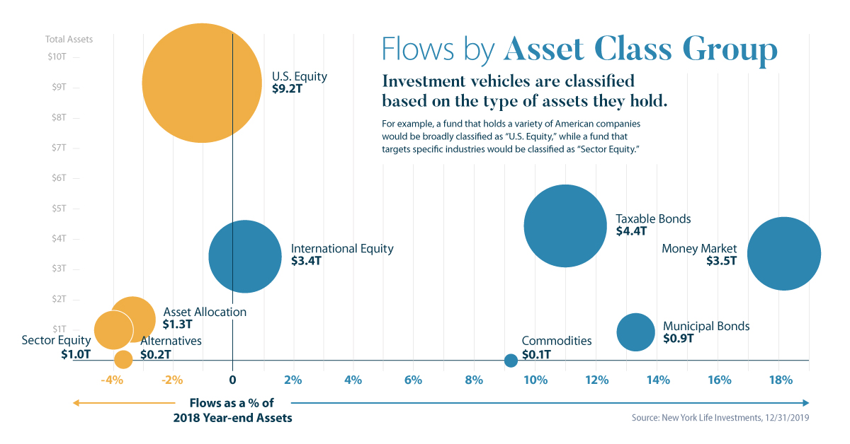
Flows by Asset Class Group
To get more specific, investment vehicles are classified based on the type of assets they hold.
For example, a fund that holds a variety of American company stocks would be broadly classified as “U.S. Equity,” while a fund that targets specific industries would be classified as “Sector Equity.” Here are the flows each asset class experienced throughout 2019, starting with the largest net inflows:
| Asset Class Group | 2019 Net Flows | 2019 Total Assets |
|---|---|---|
| Money Market | +$522B | $3,483B |
| Taxable Bonds | +$413B | $4,433B |
| Municipal Bonds | +$106B | $952B |
| International Equity | +$11B | $3,416B |
| Commodities | +$8B | $110B |
| Alternatives | -$7B | $212B |
| Sector Equity | -$33B | $995B |
| Asset Allocation | -$38B | $1,343B |
| U.S. Equity | -$72B | $9,162B |
Investors pulled money from asset allocation funds, as well as alternatives, sector equity, and U.S. equity vehicles. Trade tensions between the U.S. and China, which have had a material impact on both countries’ economies, may have been a reason for this conservatism. Other likely factors include the Hong Kong protests and the culmination of Brexit.
In the face of these worrying developments, fixed income vehicles were in high demand, even as the Fed cut rates on three separate occasions. Money market funds had a massive year, and were responsible for much of the investor capital diverted to mutual funds in 2019.
In fact, with a Q3 net inflow of $224B, money market funds saw their strongest quarterly inflows since the global financial crisis.
Deeper Dive: Commodities
One of the most compelling flow trends of 2019 lies in commodities, which we can break down into five subcategories:
| Commodities Subcategory | 2019 Net Flows |
|---|---|
| Precious Metals | +$11.4B |
| Industrial Metals | -$0.1B |
| Energy | -$0.2B |
| Broad Basket | -$0.8B |
| Agriculture | -$2.2B |
Precious metals, which include safe-haven assets like gold and silver, were the only subcategory to see positive net flows in 2019. Likely driven by the fear of inflation, investors flocked to precious metals from June to October.
Gold and silver are often referred to as “safe-haven” assets because they outperform during periods of uncertainty.
The Motley Fool
It’s interesting to note that investors pulled money out of precious metals in November and December—perhaps a sign of growing confidence in the economy.
2020 and Beyond
Due to the ongoing COVID-19 pandemic, volatility has returned to global markets.
While the conservative asset allocation decisions made in 2019 may have given investors some shelter from this turmoil, it’s likely they paid a penalty for missing out on a robust year for equity markets.
In uncertain times like these, it’s important for every long-term investor to keep a cool head. After all, history has shown us that markets will eventually recover.


Infographics
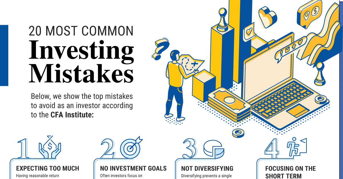
The 20 Most Common Investment Mistakes, in One Chart
Here are the top investment mistakes to avoid, from emotionally driven investing to paying too much in fees.
The 20 Most Common Investment Mistakes
No one is immune to errors, including the best investors in the world.
Fortunately, investment mistakes can provide valuable lessons over time, providing investors an opportunity to gain insights on investing—and build more resilient portfolios.
This graphic shows the top 20 mistakes to watch out for, according to the CFA Institute.
20 Investment Mistakes to Avoid
From emotionally driven investment decisions to paying too much on fees, here are some mistakes that investors commonly make:
| Top 20 Mistakes | Description |
|---|---|
| 1. Expecting Too Much | Having reasonable return expectations helps investors keep a long-term view without reacting emotionally. |
| 2. No Investment Goals | Often investors focus on short-term returns or the latest investment craze instead of their long-term investment goals. |
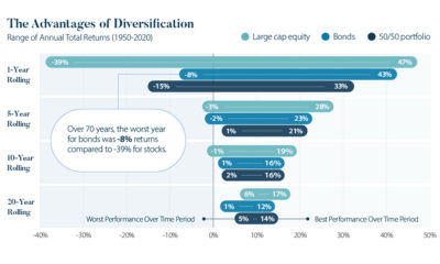
| 3. Not Diversifying | Diversifying prevents a single stock from drastically impacting the value of your portfolio. |
| 4. Focusing on the Short Term | It’s easy to focus on the short term, but this can make investors second-guess their original strategy and make careless decisions. |
| 5. Buying High and Selling Low | Investor behavior during market swings often hinders overall performance. |
| 6. Trading Too Much | One study shows that the most active traders underperformed the U.S. stock market by 6.5% on average annually. Source: The Journal of Finance |
| 7. Paying Too Much in Fees | Fees can meaningfully impact your overall investment performance, especially over the long run. |
| 8. Focusing Too Much on Taxes | While tax-loss harvesting can boost returns, making a decision solely based on its tax consequences may not always be merited. |
| 9. Not Reviewing Investments Regularly | Review your portfolio quarterly or annually to make sure you’re staying on track or if your portfolio is in need of rebalancing. |
| 10. Misunderstanding Risk | Too much risk can take you out of your comfort zone, but too little risk may result in lower returns that do not reach your financial goals. Recognize the right balance for your personal situation. |
| 11. Not Knowing Your Performance | Often, investors don’t actually know the performance of their investments. Review your returns to track if you are meeting your investment goals factoring in fees and inflation. |
| 12. Reacting to the Media | Negative news in the short-term can trigger fear, but remember to focus on the long run. |
| 13. Forgetting About Inflation | Historically, inflation has averaged 4% annually. Value of $100 at 4% Annual Inflation After 1 Year: $96 After 20 Years: $44 |
| 14. Trying to Time the Market | Market timing is extremely hard. Staying in the market can generate much higher returns versus trying to time the market perfectly. |
| 15. Not Doing Due Diligence | Check the credentials of your advisor through sites like BrokerCheck, which shows their employment history and complaints. |
| 16. Working With the Wrong Advisor | Taking the time to find the right advisor is worth it. Vet your advisor carefully to ensure your goals are aligned. |
| 17. Investing With Emotions | Although it can be challenging, remember to stay rational during market fluctuations. |
| 18. Chasing Yield | High-yielding investments often carry the highest risk. Carefully assess your risk profile before investing in these types of assets. |
| 19. Neglecting to Start | Consider two people investing $200 monthly assuming a 7% annual rate of return until the age of 65. If one person started at age 25, their end portfolio would be $520K, but if the other started at 35 it would total about $245K. |
| 20. Not Controlling What You Can | While no one can predict the market, investors can control small contributions over time, which can have powerful outcomes. |
For instance, not properly diversifying can expose you to higher risk. Holding one concentrated position can drastically impact the value of your portfolio when prices fluctuate.
In fact, one study shows that the optimal diversification for a large-cap portfolio is holding 15 stocks. In this way, it helps capture the highest possible return relative to risk. When it came to a small-cap portfolio, the number of stocks rose to 26 for optimal risk reduction.
It’s worth noting that one size does not fit all, and seeking financial advice can help you find the right balance based on your financial goals.
Another common mistake is trading too much. Since each trade can rake up fees, this can impact your overall portfolio performance. A separate study showed that the most active traders saw the worst returns, underperforming the U.S. stock market by 6.5% on average annually.
Finally, it’s important to carefully monitor your investments regularly as market conditions change, factoring in fees and inflation. This will let you know if your investments are on track, or if you need to adjust based on changing personal circumstances or other factors.
Controlling What You Can
To help avoid these mistakes, investors can remember to stay rational and focus on their long-term goals. Building a solid portfolio often involves assessing the following factors:
- Financial goals
- Current income
- Spending habits
- Market environment
- Expected returns
With these factors in mind, investors can avoid focusing on short-term market swings, and control what they can. Making small investments over the long run can have powerful effects, with the potential to accumulate significant wealth simply by investing consistently over time.
Infographics
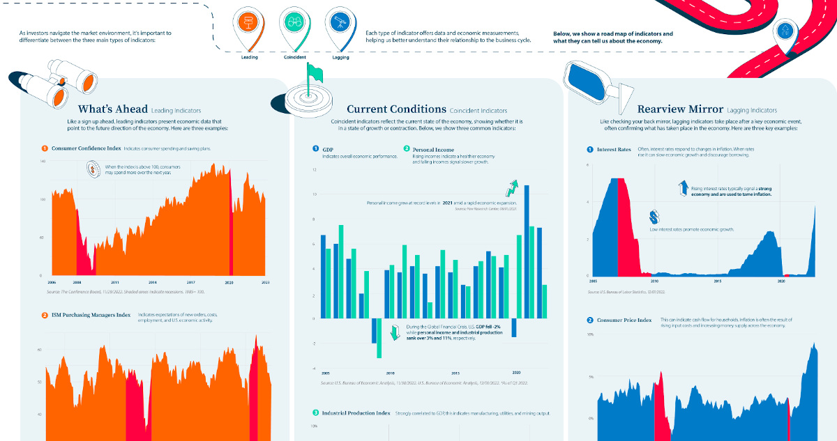
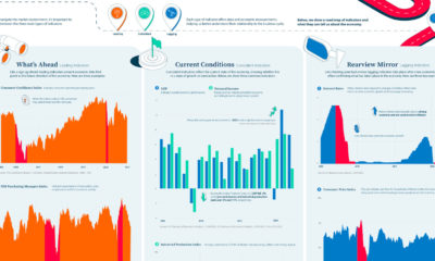
Visual Guide: The Three Types of Economic Indicators
From GDP to interest rates, this infographic shows key economic indicators for navigating the massive U.S. economy.
View the high resolution version of this infographic. Buy the poster.
A Visual Guide to Economic Indicators
Economic indicators provide insight on the state of financial markets.
Each type of indicator offers data and economic measurements, helping us better understand their relationship to the business cycle. As investors navigate the market environment, it’s important to differentiate between the three main types of indicators:
- Leading
- Coincident
- Lagging
The above infographic from New York Life Investments shows a road map of indicators and what they can tell us about the economy.
What’s Ahead: Leading Indicators
Leading indicators present economic data that point to the future direction of the economy like a sign up ahead. Here are three examples.
1. Consumer Confidence Index
This key measure indicates consumer spending and saving plans. When the index is above 100, consumers may spend more over the next year. In December, the index jumped to 108 up from 101 in November. This was in part due to lower inflation expectations and improving job prospects.
In the December survey, 48% indicated that the job market remained strong, highlighting the strength of employment opportunities and likely influencing sentiment towards spending in the future.
2. ISM Purchasing Managers Index
The ISM Purchasing Managers Index indicates expectations of new orders, costs, employment, and U.S. economic activity in the manufacturing sector. The following table shows how the index is broken down based on select measures:
| Index | Nov 2022 | Oct 2022 | Percentage Point Change | Direction | Trend (Months) |
|---|---|---|---|---|---|
| Manufacturing PMI | 49.0 | 50.2 | -1.2 | Contracting | 1 |
| New Orders | 47.2 | 49.2 | -2.0 | Contracting | 3 |
| Employment | 48.4 | 50.0 | -1.6 | Contracting | 1 |
| Prices | 43.0 | 46.6 | -3.6 | Decreasing | 2 |
| Imports | 46.6 | 50.8 | -4.2 | Contracting | 1 |
| Manufacturing Sector | Contracting | 1 |
For instance, in November the index fell into its first month of contraction since May 2020. Falling new orders signal that demand has weakened while contracting employment figures indicate lower output across the sector.
3. S&P 500 Index
The S&P 500 Index indicates the economy’s direction since forward-looking performance is factored into prices. In this way, the S&P 500 Index can represent investor confidence as the index often serves as a proxy for U.S. equity markets. In 2022, returns for the index are roughly -20% year-to-date.
Current Conditions: Coincident Indicators
Coincident indicators reflect the current state of the economy, showing whether it is in a state of growth or contraction.
1. GDP
GDP indicates overall economic performance. Typically it serves as the most comprehensive gauge of the economy since it tracks output across all sectors. In the third quarter of 2022, real U.S. GDP increased 2.9% on an annual basis. That compares to 2.7% for the same period in 2021.
2. Personal Income
Rising incomes indicate a healthier economy and falling incomes signal slower growth. Personal income grew at record levels in 2021 to 7.4% annually amid a rapid economic expansion.
This year, U.S. personal income has grown at a slower pace, at 2.7% on an annual basis as of the third quarter.
3. Industrial Production Index
Strongly correlated to GDP, the industrial production index indicates manufacturing, utilities, and mining output. Below, we show trends in industrial production and how they correspond with GDP and personal income indicators.
| Date | U.S. GDP | Personal Income | Industrial Production |
|---|---|---|---|
| 2022* | 7.3% | 2.7% | 4.7% |
| 2021 | 10.7% | 7.4% | 4.9% |
| 2020 | -1.5% | 6.7% | -7.0% |
| 2019 | 4.1% | 5.1% | -0.7% |
| 2018 | 5.4% | 5.0% | 3.2% |
| 2017 | 4.2% | 4.6% | 1.4% |
| 2016 | 2.7% | 2.6% | -2.0% |
| 2015 | 3.7% | 4.7% | -1.4% |
| 2014 | 4.2% | 5.5% | 3.0% |
| 2013 | 3.6% | 1.3% | 2.0% |
| 2012 | 4.2% | 5.1% | 3.0% |
| 2011 | 3.7% | 5.9% | 3.2% |
| 2010 | 3.9% | 4.3% | 5.5% |
| 2009 | -2.0% | -3.2% | -11.4% |
| 2008 | 2.0% | 3.8% | -3.5% |
| 2007 | 4.8% | 5.6% | 2.5% |
| 2006 | 6.0% | 7.5% | 2.3% |
| 2005 | 6.7% | 5.6% | 3.3% |
*As of Q3 2022.
As the above table shows, factory production collapsed following the 2008 financial crisis, a key indicator for the depth of an economic downturn. Meanwhile, personal income sank over -3% while GDP fell -2%.
Despite economic uncertainty in 2022, industrial production remains positive, at a 4.7% growth rate, albeit somewhat slower than 2021 levels.
Rearview Mirror: Lagging Indicators
Like checking your back mirror, lagging indicators take place after a key economic event, often confirming what has taken place in the economy. Here are three key examples.
1. Interest Rates
Often, interest rates respond to changes in inflation. When rates rise it can slow economic growth and discourage borrowing. Rising interest rates typically signal a strong economy and are used to tame inflation. On the other hand, low interest rates promote economic growth.
Following years of record-low interest rates, the Federal Funds rate increased at the fastest rate in decades over 2022, jumping from 0.25% in March to 4.25% in December as inflation accelerated.
2. Consumer Price Index
This inflation measure can indicate cash flow for households. Inflation is often the result of rising input costs and increasing money supply across the economy.
Sometimes, inflation can reach a peak after an expansion has ended as rising demand in an economy has pushed up prices. In November, U.S. inflation reached 7.1% annually amid supply chain disruptions and price pressures across food prices, medical prices, and housing costs.
| Year | Inflation Rate | Annual Change |
|---|---|---|
| 2022* | 7.1% | 2.4% |
| 2021 | 4.7% | 3.5% |
| 2020 | 1.2% | -0.6% |
| 2019 | 1.8% | -0.6% |
| 2018 | 2.4% | 0.3% |
| 2017 | 2.1% | 0.9% |
| 2016 | 1.3% | 1.1% |
| 2015 | 0.1% | -1.5% |
| 2014 | 1.6% | 0.2% |
| 2013 | 1.5% | -0.6% |
| 2012 | 2.1% | -1.1% |
| 2011 | 3.2% | 1.5% |
| 2010 | 1.6% | 2.0% |
| 2009 | -0.4% | -4.2% |
| 2008 | 3.8% | 1.0% |
| 2007 | 2.9% | -0.4% |
| 2006 | 3.2% | -0.2% |
| 2005 | 3.4% | 0.7% |
*As of November 2022.
3. Unemployment Rate
The unemployment rate has many spillover effects, impacting consumer spending and in turn retail sales and GDP. Historically, unemployment falls slowly after an economic recovery which is why it’s considered a lagging indicator. When the unemployment rate rises it confirms lagging economic performance.
Overall, 2022 has been characterized by a strong job market, with unemployment levels below historical averages, at 3.7% as of October.
On the Road
To get a more comprehensive picture of the economy, combining a number of indicators is more effective than isolating a few variables. With these tools, investors can gain more perspective on the cyclical nature of the business cycle while keeping a long-term perspective in mind on the road ahead.

The Top 5 Reasons Clients Fire a Financial Advisor

The Top 5 Reasons Clients Hire a Financial Advisor

Visualizing the Growth of $100, by Asset Class

How Small Investments Make a Big Impact Over Time

What Were the Top Performing Investment Themes of 2023?
-
 Infographics2 years ago
The Top Investment Quotes Every Investor Should Know
-
 Markets in a Minute2 years ago
Mapped: The Growth in U.S. House Prices by State
-
 Markets in a Minute2 years ago
How Closely Related Are Historical Mortgage Rates and Housing Prices?
-
 Infographics2 years ago
A Visual Guide to Stagflation, Inflation, and Deflation
-
 Markets in a Minute1 year ago
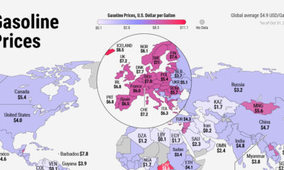
Mapped: Global Energy Prices, by Country in 2022
-
 Markets in a Minute2 years ago
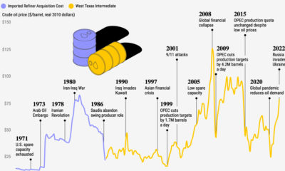
Visualizing Historical Oil Prices (1968-2022)
-
 Infographics1 year ago
Visual Guide: The Three Types of Economic Indicators
-
 Markets in a Minute2 years ago
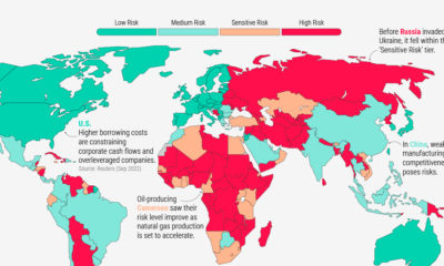
Mapped: Global Macroeconomic Risk, by Country in 2022