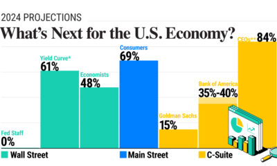

In this graphic, we show U.S. economic forecasts across Wall Street, Main Street, and C-Suite amid mixed signals in the economy.
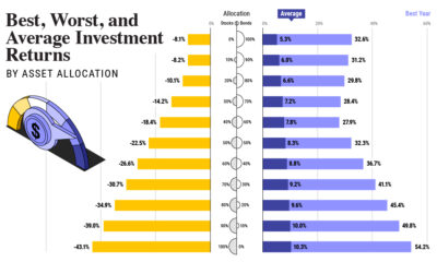

How have investment returns for different portfolio allocations of stocks and bonds compared over the last 90 years?
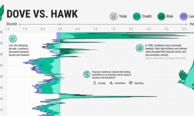

We show the Financial Conditions Index, which breaks down the state of U.S. financial markets based on 105 indicators.
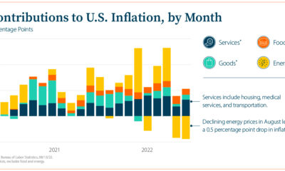

This infographic explores questions on today’s inflationary environment as the economy faces persistent price pressures.
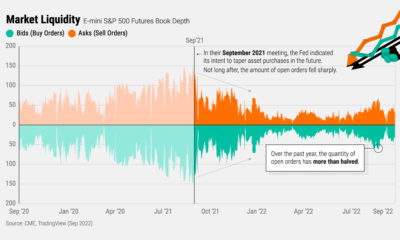

Interest rate hikes and quantitative tightening are reducing liquidity and raising volatility in markets, but why exactly does this happen?
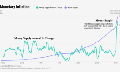

What are the different types of inflation? Which economic forces impact each type? Below, we chart each over modern history.
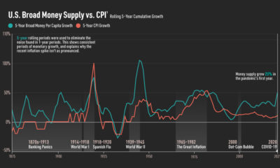

The money supply has surged in recent years. Here is a chart that shows money supply and inflation since 1875.
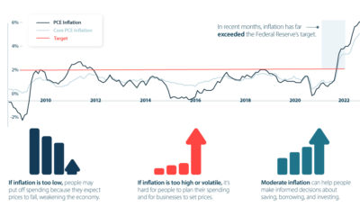

The target interest rate could rise more than 3% by 2023. Here's how rising interest rates impact the economy and your investments.
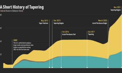

Broadly speaking, Fed tapering is the reversal of quantitative easing. We show the history of Federal Reserve bond tapering and how it works.
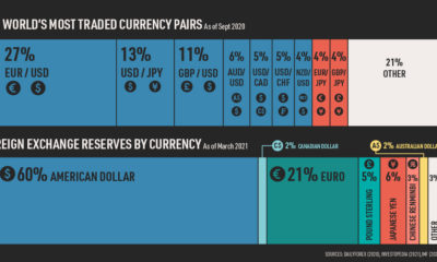

The U.S. dollar has been the world's dominant currency since World War II. In this chart, we provide a snapshot of its current global standing.