Markets in a Minute
The Pyramid of Equity Returns: Almost 200 Years of U.S. Stock Performance
This Markets in a Minute Chart is available as a poster.
This Markets in a Minute Chart is available as a poster.
Historical Stock Market Returns
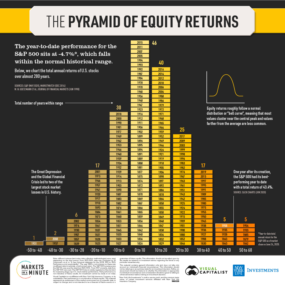
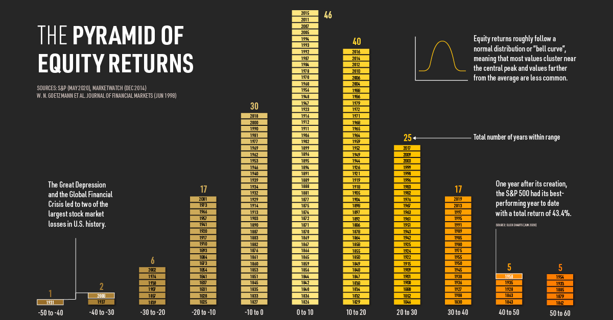
After the fastest bear market drop in history, the S&P 500 rallied and now has a year-to-date total return of -4.7%. The year is not over, but in the context of history, is this in line with what’s considered a “normal” return, or is it more of an outlier?
In today’s Markets in a Minute chart from New York Life Investments, we show the distribution of U.S. equity returns over almost 200 years.
Total Returns By Year
The chart shows total annual returns, which assumes that dividends and other cash distributions are reinvested back into the index.
It’s also important to note that different indexes and data collection methods are used over the timeframe. From 1825-1925, numbers come from researchers at Yale University and Pennsylvania State University. They collected price and dividend data for almost all stocks listed on the New York Stock Exchange during its early history.
From 1926-1956, returns are from the S&P 90, the S&P 500’s predecessor. Finally, from 1957 to date, returns are based on the S&P 500.
Here are historical stock market returns by year:
| Year | Total Return |
|---|---|
| 1825 | -10.46% |
| 1826 | 0.81% |
| 1827 | -3.28% |
| 1828 | -15.13% |
| 1829 | 13.54% |
| 1830 | 30.14% |
| 1831 | -15.35% |
| 1832 | 11.62% |
| 1833 | -3.16% |
| 1834 | 11.75% |
| 1835 | -3.91% |
| 1836 | 5.92% |
| 1837 | -15.91% |
| 1838 | 18.47% |
| 1839 | -21.34% |
| 1840 | 6.54% |
| 1841 | -18.66% |
| 1842 | 8.11% |
| 1843 | 46.34% |
| 1844 | 9.66% |
| 1845 | -7.46% |
| 1846 | 26.57% |
| 1847 | 13.20% |
| 1848 | 10.45% |
| 1849 | 15.40% |
| 1850 | 14.21% |
| 1851 | -1.35% |
| 1852 | 22.59% |
| 1853 | -4.03% |
| 1854 | -18.35% |
| 1855 | 18.34% |
| 1856 | 5.49% |
| 1857 | -20.82% |
| 1858 | 13.22% |
| 1859 | 2.24% |
| 1860 | -1.53% |
| 1861 | -0.52% |
| 1862 | 52.75% |
| 1863 | 44.47% |
| 1864 | 14.71% |
| 1865 | 2.64% |
| 1866 | 4.85% |
| 1867 | 1.88% |
| 1868 | - |
| 1869 | 1.33% |
| 1870 | 2.77% |
| 1871 | 9.20% |
| 1872 | 6.83% |
| 1873 | -11.19% |
| 1874 | 1.70% |
| 1875 | 1.89% |
| 1876 | -6.45% |
| 1877 | 7.05% |
| 1878 | 16.04% |
| 1879 | 57.10% |
| 1880 | 25.12% |
| 1881 | 7.36% |
| 1882 | -4.22% |
| 1883 | -9.39% |
| 1884 | -18.47% |
| 1885 | 50.85% |
| 1886 | 16.69% |
| 1887 | -7.70% |
| 1888 | 6.45% |
| 1889 | 8.77% |
| 1890 | -6.59% |
| 1891 | 7.74% |
| 1892 | 14.79% |
| 1893 | -12.33% |
| 1894 | 1.94% |
| 1895 | 6.56% |
| 1896 | 4.86% |
| 1897 | 18.41% |
| 1898 | 16.38% |
| 1899 | 7.89% |
| 1900 | 22.97% |
| 1901 | 29.26% |
| 1902 | 9.44% |
| 1903 | -8.53% |
| 1904 | 19.66% |
| 1905 | 10.67% |
| 1906 | 3.10% |
| 1907 | -21.79% |
| 1908 | 34.56% |
| 1909 | 22.99% |
| 1910 | -10.94% |
| 1911 | 7.37% |
| 1912 | 5.30% |
| 1913 | -9.32% |
| 1914 | -3.25% |
| 1915 | 21.73% |
| 1916 | 7.19% |
| 1917 | -16.44% |
| 1918 | 11.27% |
| 1919 | 16.09% |
| 1920 | -15.02% |
| 1921 | 11.02% |
| 1922 | 26.72% |
| 1923 | 3.90% |
| 1924 | 25.77% |
| 1925 | 29.12% |
| 1926 | 11.62% |
| 1927 | 37.49% |
| 1928 | 43.61% |
| 1929 | -8.42% |
| 1930 | -24.90% |
| 1931 | -43.34% |
| 1932 | -8.19% |
| 1933 | 53.99% |
| 1934 | -1.44% |
| 1935 | 47.67% |
| 1936 | 33.92% |
| 1937 | -35.03% |
| 1938 | 31.12% |
| 1939 | -0.41% |
| 1940 | -9.78% |
| 1941 | -11.59% |
| 1942 | 20.34% |
| 1943 | 25.90% |
| 1944 | 19.75% |
| 1945 | 36.44% |
| 1946 | -8.07% |
| 1947 | 5.71% |
| 1948 | 5.50% |
| 1949 | 18.79% |
| 1950 | 31.71% |
| 1951 | 24.02% |
| 1952 | 18.37% |
| 1953 | -0.99% |
| 1954 | 52.62% |
| 1955 | 31.56% |
| 1956 | 6.56% |
| 1957 | -10.78% |
| 1958 | 43.36% |
| 1959 | 11.96% |
| 1960 | 0.47% |
| 1961 | 26.89% |
| 1962 | -8.73% |
| 1963 | 22.80% |
| 1964 | 16.48% |
| 1965 | 12.45% |
| 1966 | -10.06% |
| 1967 | 23.98% |
| 1968 | 11.06% |
| 1969 | -8.50% |
| 1970 | 4.01% |
| 1971 | 14.31% |
| 1972 | 18.98% |
| 1973 | -14.66% |
| 1974 | -26.47% |
| 1975 | 37.20% |
| 1976 | 23.84% |
| 1977 | -7.18% |
| 1978 | 6.56% |
| 1979 | 18.44% |
| 1980 | 32.42% |
| 1981 | -4.91% |
| 1982 | 21.55% |
| 1983 | 22.56% |
| 1984 | 6.27% |
| 1985 | 31.73% |
| 1986 | 18.67% |
| 1987 | 5.25% |
| 1988 | 16.61% |
| 1989 | 31.69% |
| 1990 | -3.10% |
| 1991 | 30.47% |
| 1992 | 7.62% |
| 1993 | 10.08% |
| 1994 | 1.32% |
| 1995 | 37.58% |
| 1996 | 22.96% |
| 1997 | 33.36% |
| 1998 | 28.58% |
| 1999 | 21.04% |
| 2000 | -9.10% |
| 2001 | -11.89% |
| 2002 | -22.10% |
| 2003 | 28.68% |
| 2004 | 10.88% |
| 2005 | 4.91% |
| 2006 | 15.79% |
| 2007 | 5.49% |
| 2008 | -37.00% |
| 2009 | 26.46% |
| 2010 | 15.06% |
| 2011 | 2.11% |
| 2012 | 16.00% |
| 2013 | 32.39% |
| 2014 | 13.69% |
| 2015 | 1.38% |
| 2016 | 11.96% |
| 2017 | 21.83% |
| 2018 | -4.38% |
| 2019 | 31.49% |
Source: Journal of Financial Markets, Slickcharts. The year 1868 has insufficient data to estimate a total annual return.
U.S. equity returns roughly follow a bell curve, meaning that values cluster near a central peak and values farther from the average are less common. Historically, they have been skewed towards positive performance.
Here is how the distribution of returns stack up:
| Total Annual Return (%) | -50 to -30 | -30 to -10 | -10 to 10 | 10 to 30 | 30 to 50 | 50+ |
|---|---|---|---|---|---|---|
| Number of Years Within Range | 3 | 23 | 76 | 65 | 22 | 5 |
| Percent of Years Within Range | 1.5% | 11.9% | 39.2% | 33.5% | 11.3% | 2.6% |
While extreme returns can happen, almost 40% of annual returns have fallen within the -10% to 10% range.
Recessions and Recoveries
What does it look like when more abnormal returns occur? Due to the cyclical nature of the economy, recessions tend to be followed by strong recoveries.
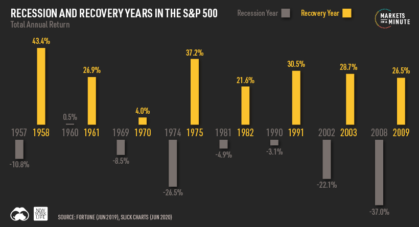
In 1957, the year the S&P 500 was created, the stock market saw a loss of almost 11%. Stock prices shot up by over 43% the following year, bolstered by rising credit volumes and business profits.
Most recently, the 2008 global financial crisis led to one of the largest equity losses to date. In 2009, stocks climbed by almost 27%, boosted by expectations of higher capital spending and demand as the economy recovered.
What History Tells Us
While equities can have high volatility, returns have historically followed a positively-skewed bell curve distribution. From 1825-2019, the average total annual return was 9.56%. In fact, over 70% of total annual returns have been positive over the same timeframe.
Owning stocks long-term may help investors not only beat inflation, but also build a nest egg that may sustain them throughout their retirement years.


Markets in a Minute
The Top 5 Reasons Clients Fire a Financial Advisor
Firing an advisor is often driven by more than cost and performance factors. Here are the top reasons clients ‘break up’ with their advisors.

The Top 5 Reasons Clients Fire a Financial Advisor
What drives investors to fire a financial advisor?
From saving for a down payment to planning for retirement, clients turn to advisors to guide them through life’s complex financial decisions. However, many of the key reasons for firing a financial advisor stem from emotional factors, and go beyond purely financial motivations.
We partnered with Morningstar to show the top reasons clients fire an advisor to provide insight on what’s driving investor behavior.
What Drives Firing Decisions?
Here are the top reasons clients terminated their advisor, based on a survey of 184 respondents:
| Reason for Firing | % of Respondents Citing This Reason | Type of Motivation |
|---|---|---|
| Quality of financial advice and services | 32% | Emotion-based reason |
| Quality of relationship | 21% | Emotion-based reason |
| Cost of services | 17% | Financial-based reason |
| Return performance | 11% | Financial-based reason |
| Comfort handling financial issues on their own | 10% | Emotion-based reason |
Numbers may not total 100 due to rounding. Respondents could select more than one answer.
Numbers may not total 100 due to rounding. Respondents could select more than one answer.
While firing an advisor is rare, many of the primary drivers behind firing decisions are also emotionally driven.
Often, advisors were fired due to the quality of the relationship. In many cases, this was due to an advisor not dedicating enough time to fully grasp their personal financial goals. Additionally, wealthier, and more financially literate clients are more likely to fire their advisors—highlighting the importance of understanding the client.
Key Takeaways
Given these driving factors, here are five ways that advisors can build a lasting relationship through recognizing their clients’ emotional needs:
- Understand your clients’ deeper goals
- Reach out proactively
- Act as a financial coach
- Keep clients updated
- Conduct goal-setting exercises on a regular basis
By communicating their value and setting expectations early, advisors can help prevent setbacks in their practice by adeptly recognizing the emotional motivators of their clients.
Markets in a Minute
The Top 5 Reasons Clients Hire a Financial Advisor
Here are the most common drivers for hiring a financial advisor, revealing that investor motivations go beyond just financial factors.

The Top 5 Reasons Clients Hire a Financial Advisor
What drives investors to hire a financial advisor?
From saving for a down payment to planning for retirement, clients turn to advisors to guide them through life’s complex financial decisions. However, many of the key reasons for hiring a financial advisor stem from emotional factors, and go beyond purely financial motivations.
We partnered with Morningstar to show the top reasons clients hire a financial advisor to provide insight on what’s driving investor behavior.
What Drives Hiring Decisions?
Here are the most common reasons for hiring an advisor, based on a survey of 312 respondents.
| Reason for Hiring | % of Respondents Citing This Reason | Type of Motivation |
|---|---|---|
| Specific goals or needs | 32% | Financial-based reason |
| Discomfort handling finances | 32% | Emotion-based reason |
| Behavioral coaching | 17% | Emotion-based reason |
| Recommended by family or friends | 12% | Emotion-based reason |
| Quality of relationship | 10% | Emotion-based reason |
Numbers may not total 100 due to rounding. Respondents could select more than one answer.
While financial factors played an important role in hiring decisions, emotional reasons made up the largest share of total responses.
This illustrates that clients place a high degree of importance on reaching specific goals or needs, and how an advisor communicates with them. Furthermore, clients seek out advisors for behavioral coaching to help them make informed decisions while staying the course.
Key Takeaways
With this in mind, here are five ways advisors can provide value to their clients and grow their practice:
- Address clients’ emotional needs early on
- Demonstrate how you can offer support
- Use ordinary language
- Provide education to help clients stay on track
- Acknowledge that these are issues we all face
By addressing emotional factors, advisors can more effectively help clients’ navigate intricate financial decisions and avoid common behavioral mistakes.

The Top 5 Reasons Clients Fire a Financial Advisor

The Top 5 Reasons Clients Hire a Financial Advisor

Visualizing the Growth of $100, by Asset Class

How Small Investments Make a Big Impact Over Time

What Were the Top Performing Investment Themes of 2023?
-
 Infographics2 years ago
The Top Investment Quotes Every Investor Should Know
-
 Markets in a Minute2 years ago
Mapped: The Growth in U.S. House Prices by State
-
 Markets in a Minute2 years ago
How Closely Related Are Historical Mortgage Rates and Housing Prices?
-
 Infographics2 years ago
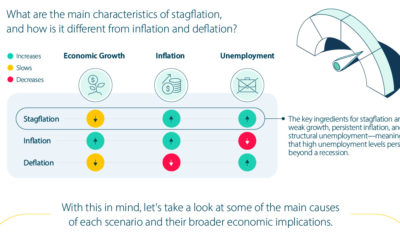
A Visual Guide to Stagflation, Inflation, and Deflation
-
 Markets in a Minute1 year ago
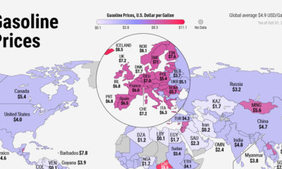
Mapped: Global Energy Prices, by Country in 2022
-
 Infographics3 years ago
The 5 Fastest Growing Industries of the Next Decade
-
 Markets in a Minute2 years ago
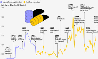
Visualizing Historical Oil Prices (1968-2022)
-
 Infographics1 year ago
Visual Guide: The Three Types of Economic Indicators