Markets in a Minute
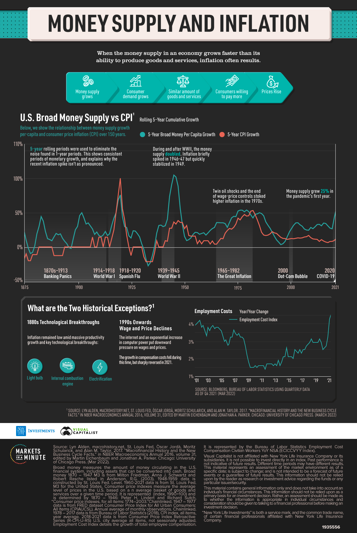
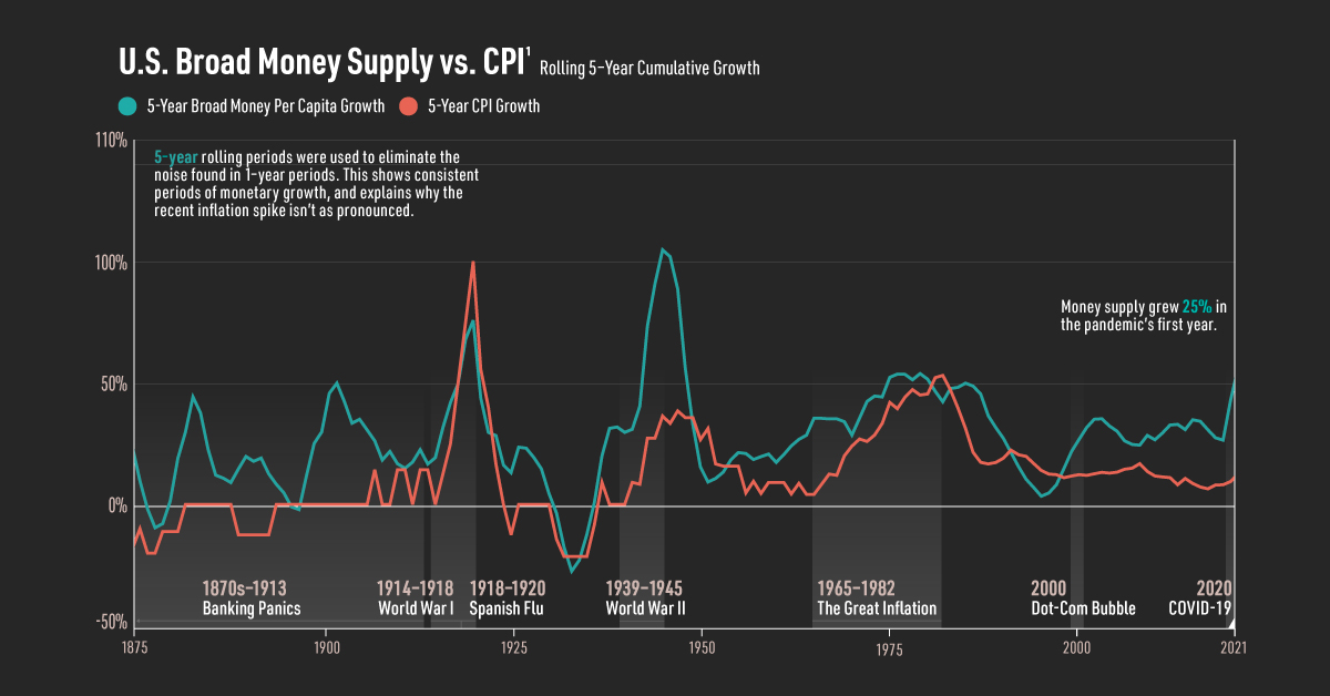
Chart: Money Supply and Inflation Over 150 Years
This infographic is available as a poster.
This infographic is available as a poster.
Chart: Money Supply and Inflation Over 150 Years
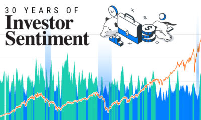
How closely are money supply and inflation related?
This Markets in a Minute from New York Life Investments shows the trajectory of money supply and inflation, taking a historical look at their relationship since the Industrial Revolution.
Defining Money Supply and Inflation
To start, here is a brief overview of money supply and inflation:
- Broad money supply: measures the amount of money circulating in the U.S. financial system, including assets that can be converted into cash.
- Inflation: measured by the consumer price index (CPI), inflation is the average level of prices in the U.S. based on a basket of goods and services over a given time period.
When more capital is injected into the economy, it can cause consumer demand to grow. Assuming a similar amount of goods and services available, consumers are willing to pay more–which leads to rising prices.
Money Supply and Inflation Over History
Here are the key periods where money supply per capita was the highest in recent history.
Five-year rolling periods were used to eliminate the noise found in one-year periods. As a result, this shows consistent periods of monetary growth, and explains why the recent inflation spike isn’t as pronounced.
As seen in the table below, there were five periods where broad money per capita growth exceeded 50%.
| Time Period | Peak 5-Year Broad Money Per Capita Growth* | 5-Year CPI Growth |
|---|---|---|
| 1902 (Industrial Revolution) | 50% | 0% |
| 1920 (post-WWI) | 76% | 100% |
| 1945 (WWII) | 105% | 36% |
| 1979 (Great Inflation) | 54% | 45% |
| 2021 (COVID-19) | 56% | 13% |
*Rolling 5-year cumulative growth
Source: Lyn Alden, macrohistory.net, St. Louis Fed, Òscar Jordà, Moritz Schularick, and Alan M. Taylor. 2017. “Macrofinancial History and the New Business Cycle Facts.” in NBER Macroeconomics Annual 2016, volume 31, edited by Martin Eichenbaum and Jonathan A. Parker. Chicago: University of Chicago Press. (Mar 2022)
During WWII, the money supply doubled to finance war efforts. Inflation was high during and after this time, particularly in 1946-47, but returned to stability in 1949.
Amid soaring government deficits in the 1970s, inflation climbed upwards. In response the U.S. abandoned the monetary system established in WWII, decoupling from the gold standard, adopting the one we use today.
Today, while money supply per capita has grown 56%, inflation has increased, albeit at a muted rate compared to other periods. In addition, it’s been just two years since the money supply grew at such rapid rates. How inflation will play out in the future remains to be seen.
Two Historical Exceptions
There are two exceptions where inflation didn’t rise as sharply when the money supply increased.
Between 1875 and 1910, the U.S. emerged as a superpower. During this time, several technological innovations took place including the lightbulb, electrification, and the internal combustion engine. With the Spindletop oilfield advancements in 1901, more oil was produced there in one day than in all global oil fields combined.
As a result, this created real growth and vast improvements in productivity rather than inflation.
The second time period is from the 1990s onwards, with the advent of the internet. As computing power and automation improved, it led to productivity gains and deflationary pressures. As seen in the employment cost index, wage growth decreased amid globalization. Despite influxes of money supply, inflation remained low for decades.
What’s Next?
The war in Ukraine has led everything from nickel to wheat and food staples to rise in price. Supply chain disruptions are also fueling higher inflation. Whether or not today’s inflation echoes the price shocks of the 1970s or supply shock of the 1940s (or both) is an open question.
At the same time, the Fed ended its net purchases of Treasuries and mortgage-backed securities in March amid elevated inflation. These emergency measures were used to support the economy during COVID-19. Overall, they totaled $4.6 trillion and the Federal Reserve’s balance sheet doubled over two years.
Going forward, the Fed plans to significantly reduce its balance sheet and raise interest rates. Economists predict inflation will continue to rise in 2022, but long-term forecasts suggest they may fall near the Federal Reserve’s 2% goal.


Markets in a Minute
The Top 5 Reasons Clients Fire a Financial Advisor
Firing an advisor is often driven by more than cost and performance factors. Here are the top reasons clients ‘break up’ with their advisors.

The Top 5 Reasons Clients Fire a Financial Advisor
What drives investors to fire a financial advisor?
From saving for a down payment to planning for retirement, clients turn to advisors to guide them through life’s complex financial decisions. However, many of the key reasons for firing a financial advisor stem from emotional factors, and go beyond purely financial motivations.
We partnered with Morningstar to show the top reasons clients fire an advisor to provide insight on what’s driving investor behavior.
What Drives Firing Decisions?
Here are the top reasons clients terminated their advisor, based on a survey of 184 respondents:
| Reason for Firing | % of Respondents Citing This Reason | Type of Motivation |
|---|---|---|
| Quality of financial advice and services | 32% | Emotion-based reason |
| Quality of relationship | 21% | Emotion-based reason |
| Cost of services | 17% | Financial-based reason |
| Return performance | 11% | Financial-based reason |
| Comfort handling financial issues on their own | 10% | Emotion-based reason |
Numbers may not total 100 due to rounding. Respondents could select more than one answer.
Numbers may not total 100 due to rounding. Respondents could select more than one answer.
While firing an advisor is rare, many of the primary drivers behind firing decisions are also emotionally driven.
Often, advisors were fired due to the quality of the relationship. In many cases, this was due to an advisor not dedicating enough time to fully grasp their personal financial goals. Additionally, wealthier, and more financially literate clients are more likely to fire their advisors—highlighting the importance of understanding the client.
Key Takeaways
Given these driving factors, here are five ways that advisors can build a lasting relationship through recognizing their clients’ emotional needs:
- Understand your clients’ deeper goals
- Reach out proactively
- Act as a financial coach
- Keep clients updated
- Conduct goal-setting exercises on a regular basis
By communicating their value and setting expectations early, advisors can help prevent setbacks in their practice by adeptly recognizing the emotional motivators of their clients.
Markets in a Minute
The Top 5 Reasons Clients Hire a Financial Advisor
Here are the most common drivers for hiring a financial advisor, revealing that investor motivations go beyond just financial factors.

The Top 5 Reasons Clients Hire a Financial Advisor
What drives investors to hire a financial advisor?
From saving for a down payment to planning for retirement, clients turn to advisors to guide them through life’s complex financial decisions. However, many of the key reasons for hiring a financial advisor stem from emotional factors, and go beyond purely financial motivations.
We partnered with Morningstar to show the top reasons clients hire a financial advisor to provide insight on what’s driving investor behavior.
What Drives Hiring Decisions?
Here are the most common reasons for hiring an advisor, based on a survey of 312 respondents.
| Reason for Hiring | % of Respondents Citing This Reason | Type of Motivation |
|---|---|---|
| Specific goals or needs | 32% | Financial-based reason |
| Discomfort handling finances | 32% | Emotion-based reason |
| Behavioral coaching | 17% | Emotion-based reason |
| Recommended by family or friends | 12% | Emotion-based reason |
| Quality of relationship | 10% | Emotion-based reason |
Numbers may not total 100 due to rounding. Respondents could select more than one answer.
While financial factors played an important role in hiring decisions, emotional reasons made up the largest share of total responses.
This illustrates that clients place a high degree of importance on reaching specific goals or needs, and how an advisor communicates with them. Furthermore, clients seek out advisors for behavioral coaching to help them make informed decisions while staying the course.
Key Takeaways
With this in mind, here are five ways advisors can provide value to their clients and grow their practice:
- Address clients’ emotional needs early on
- Demonstrate how you can offer support
- Use ordinary language
- Provide education to help clients stay on track
- Acknowledge that these are issues we all face
By addressing emotional factors, advisors can more effectively help clients’ navigate intricate financial decisions and avoid common behavioral mistakes.

The Top 5 Reasons Clients Fire a Financial Advisor

The Top 5 Reasons Clients Hire a Financial Advisor

Visualizing the Growth of $100, by Asset Class

How Small Investments Make a Big Impact Over Time

What Were the Top Performing Investment Themes of 2023?
-
 Infographics2 years ago
The Top Investment Quotes Every Investor Should Know
-
 Markets in a Minute2 years ago
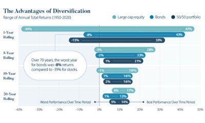
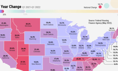
Mapped: The Growth in U.S. House Prices by State
-
 Markets in a Minute2 years ago
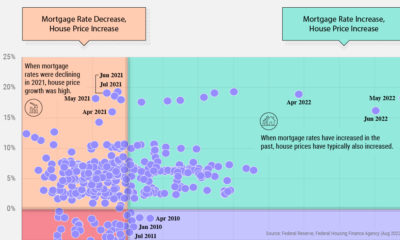
How Closely Related Are Historical Mortgage Rates and Housing Prices?
-
 Infographics2 years ago
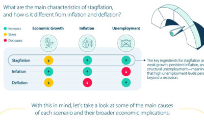
A Visual Guide to Stagflation, Inflation, and Deflation
-
 Markets in a Minute1 year ago
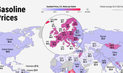
Mapped: Global Energy Prices, by Country in 2022
-
 Markets in a Minute2 years ago
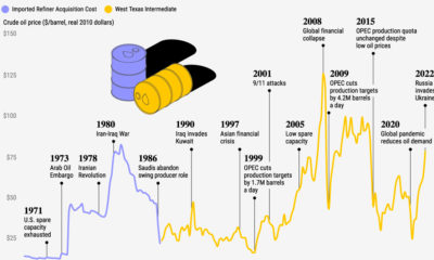
Visualizing Historical Oil Prices (1968-2022)
-
 Infographics1 year ago
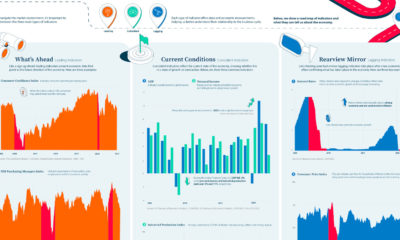
Visual Guide: The Three Types of Economic Indicators
-
 Markets in a Minute2 years ago
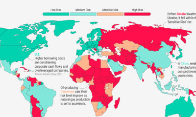
Mapped: Global Macroeconomic Risk, by Country in 2022