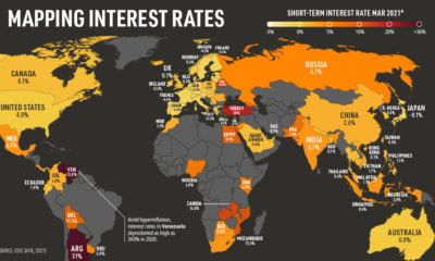

Are short-term interest rates rising or falling around the world? In this infographic we show interest rates by country in 2021.
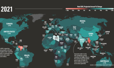

The International Monetary Fund (IMF) revised its global GDP forecasts and anticipates a strong economic recovery from COVID-19 in 2021 and beyond.
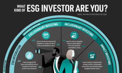

Amid a global wave of green investment, this graphic breaks down four types of environmental, social, and governance (ESG) strategies.
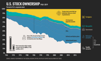

The proportion of U.S. stock owned by foreigners has climbed to 40%, while U.S. stock ownership within taxable accounts has decreased.
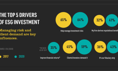

ESG investing, which considers environmental, social, and governance factors has never been more popular. What are the key drivers behind its rise?
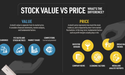

What are the underlying factors that impact stock value versus price? From investor demand to economic factors, we show the key factors for both.
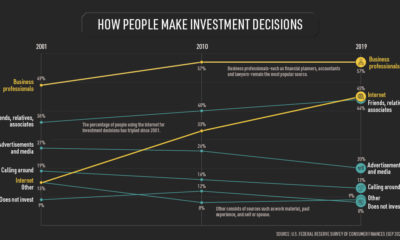

Americans rely on business professionals the most when making investment decisions, but the internet has become increasingly important.
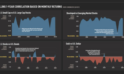

To minimize volatility, it's important to consider asset class correlation. Learn how correlation has changed over time depending on macroeconomic events.
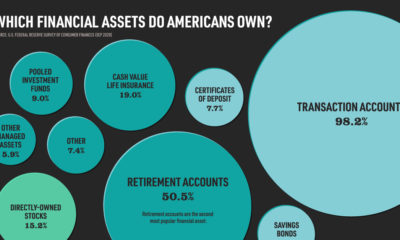

While 98% of Americans own transaction accounts, other financial assets—such as bonds and stocks—are less common.
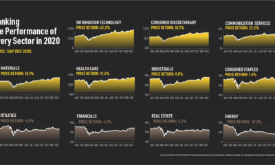

Who were the big winners of 2020? We rank the S&P performance of 11 sectors—and provide possible explanations on why the market had a strong year.