Markets in a Minute
Buy the Dip, Buy the Rise, or Follow a Plan: Which Had the Best Return?
This infographic is available as a poster.
This infographic is available as a poster.
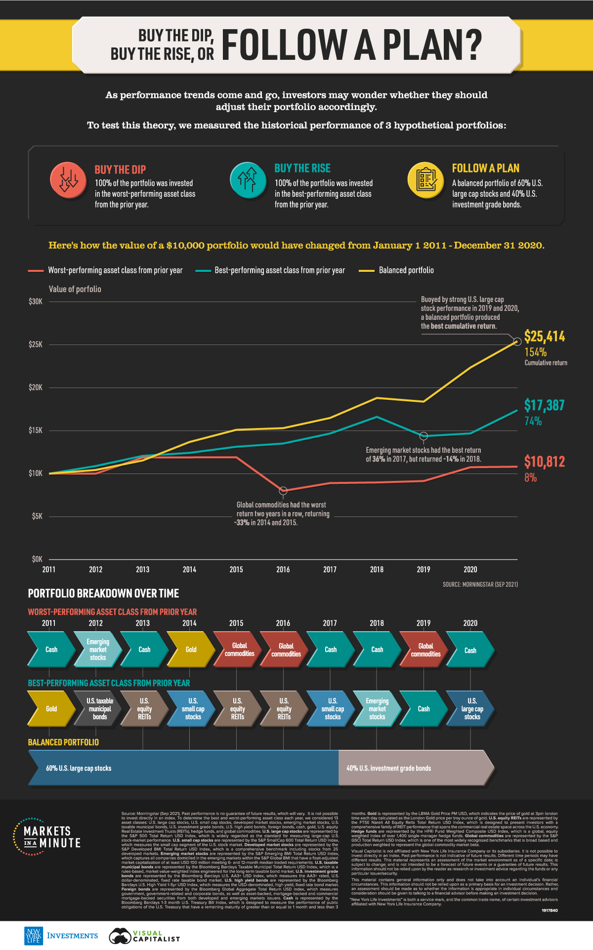
Buy the Dip, Buy the Rise, or Follow a Plan?
As performance trends come and go, investors may wonder whether they should adjust their portfolios accordingly. When prices drop, should they buy the dip in anticipation of prices going back up? Conversely, when prices rise, should they buy the rise in case the climb continues?
In this Markets in a Minute from New York Life Investments, we compare these scenarios with following a financial plan to see which one has delivered better returns.
A Tale of Three Portfolios
To evaluate these strategies, we compared the historical performance of three hypothetical portfolios:
- Buy the dip: 100% of the portfolio was invested in the worst-performing asset class from the prior year.
- Buy the rise: 100% of the portfolio was invested in the best-performing asset class from the prior year.
- Follow a plan: A balanced portfolio of 60% U.S. large cap stocks and 40% U.S. investment grade bonds for the entire duration.
We considered 13 asset classes to determine the best and worst-performing assets in each year.
| Equities | Fixed Income | Alternatives |
|---|---|---|
| U.S. Large Cap Stocks | U.S. Taxable Municipal Bonds | Gold |
| U.S. Small Cap Stocks | U.S. Investment Grade Bonds | Equity Real Estate Investment Trusts |
| Developed Market Stocks | U.S. High Yield Bonds | Hedge Funds |
| Emerging Market Stocks | Foreign Bonds | Global Commodities |
| Cash (U.S. Treasuries) |
Four were within the broad category of equities, five were under the fixed income umbrella, and four were alternative investments.
Portfolio Values Over Time
We assumed all three portfolios had the same starting value of $10,000 as of January 1, 2011. Here’s how the year-end values of the portfolios would have changed over the last decade.
| Buy the Dip | Buy the Rise | Follow a Plan | |
|---|---|---|---|
| 2011 | $10,007 | $10,893 | $10,433 |
| 2012 | $11,890 | $12,076 | $11,541 |
| 2013 | $11,896 | $12,421 | $13,689 |
| 2014 | $11,911 | $13,137 | $15,109 |
| 2015 | $7,997 | $13,509 | $15,301 |
| 2016 | $8,906 | $14,674 | $16,488 |
| 2017 | $8,979 | $16,616 | $18,814 |
| 2018 | $9,142 | $14,368 | $18,386 |
| 2019 | $10,754 | $14,685 | $22,360 |
| 2020 | $10,812 | $17,387 | $25,414 |
The buy the dip portfolio climbed steeply in 2012. Emerging market stocks, the worst-performing asset class in 2011, rebounded the following year with an annual return of 19%. Unfortunately, the buy the dip portfolio saw its value drop significantly in 2015. Global commodities had the worst return two years in a row, returning -33% in 2014 and 2015. Ultimately, the value of the buy the dip portfolio ended close to where it started, with total gains of just $812.
On the other hand, the buy the rise portfolio saw its worst annual performance in 2018. Emerging market stocks had returned an impressive 36% in 2017, but saw losses the following year. The buy the rise portfolio had its best return in 2020, when U.S. large cap stocks continued their upward climb from the year before. By the end of 2020, the buy the dip portfolio saw gains of over $7,000.
Finally, the balanced follow a plan portfolio experienced a small drop in 2018 when U.S. large cap stocks declined. However, it climbed the following two years due to a recovery in U.S. large cap stocks, which was the top-performing asset class in 2019. In the end, the balanced portfolio more than doubled its original value—the best performance of the three portfolios we analyzed.
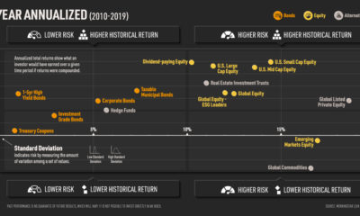
Risk and Return
Of course, return is only one side of the equation. To properly evaluate all three strategies, investors can consider both risk and return.
Below, we look at how risk and return stacked up for each portfolio over the 10 year period.
| Buy the Dip | Buy the Rise | Follow a Plan | |
|---|---|---|---|
| Cumulative Return | 8% | 74% | 154% |
| Min Annual Return | -33% | -14% | -2% |
| Median Annual Return | 1% | 7% | 11% |
| Max Annual Return | 19% | 18% | 22% |
| Standard Deviation | 14% | 9% | 7% |
Standard deviation based on annual returns.
Not only did the buy the dip strategy have the lowest cumulative return, it also had the highest risk. For instance, this portfolio experienced the biggest one-year decline of -33%, and had the highest standard deviation of 14%.
In the middle of the pack, the buy the rise portfolio’s worst drawdown was -14% and it had a standard deviation of 9%. Notably, its median annual return of 7% was much higher than that of the buy the dip portfolio.
Lastly, the follow a plan portfolio performed well on all fronts. Compared to the other two portfolios, it had the highest cumulative return and the lowest risk. Over the 10 year period, its worst annual performance was a decline of just -2%.
Buy the Dip: More Effort & More Risk
Notably, there are lots of variables that could affect the results of these strategies.
- Time period: Are there general market conditions at play? For example, U.S. large cap stocks had a bull market for most of the period we studied, boosting the return of the balanced portfolio.
- Types of securities: Is the portfolio investing in entire asset classes, or specific companies?
- Short-term or medium-term movements: Is the portfolio tracking daily dips and rises, or annual dips and rises?
However, based on this set of data, buy the dip and buy the rise strategies have historically had lower returns and higher risk than a balanced portfolio. If the market doesn’t move in the way the investor predicts, this can result in large drops in the portfolio. It also requires more effort to track these trends, and could result in higher fees from more frequent trading.
In contrast, following a balanced portfolio has historically resulted in lower risk and higher returns. By sticking to a plan, investors are also much more likely to be aligned with where they are on the investor lifecycle. This means their investment choices match up with their goals and risk tolerance.


Markets in a Minute
The Top 5 Reasons Clients Fire a Financial Advisor
Firing an advisor is often driven by more than cost and performance factors. Here are the top reasons clients ‘break up’ with their advisors.

The Top 5 Reasons Clients Fire a Financial Advisor
What drives investors to fire a financial advisor?
From saving for a down payment to planning for retirement, clients turn to advisors to guide them through life’s complex financial decisions. However, many of the key reasons for firing a financial advisor stem from emotional factors, and go beyond purely financial motivations.
We partnered with Morningstar to show the top reasons clients fire an advisor to provide insight on what’s driving investor behavior.
What Drives Firing Decisions?
Here are the top reasons clients terminated their advisor, based on a survey of 184 respondents:
| Reason for Firing | % of Respondents Citing This Reason | Type of Motivation |
|---|---|---|
| Quality of financial advice and services | 32% | Emotion-based reason |
| Quality of relationship | 21% | Emotion-based reason |
| Cost of services | 17% | Financial-based reason |
| Return performance | 11% | Financial-based reason |
| Comfort handling financial issues on their own | 10% | Emotion-based reason |
Numbers may not total 100 due to rounding. Respondents could select more than one answer.
Numbers may not total 100 due to rounding. Respondents could select more than one answer.
While firing an advisor is rare, many of the primary drivers behind firing decisions are also emotionally driven.
Often, advisors were fired due to the quality of the relationship. In many cases, this was due to an advisor not dedicating enough time to fully grasp their personal financial goals. Additionally, wealthier, and more financially literate clients are more likely to fire their advisors—highlighting the importance of understanding the client.
Key Takeaways
Given these driving factors, here are five ways that advisors can build a lasting relationship through recognizing their clients’ emotional needs:
- Understand your clients’ deeper goals
- Reach out proactively
- Act as a financial coach
- Keep clients updated
- Conduct goal-setting exercises on a regular basis
By communicating their value and setting expectations early, advisors can help prevent setbacks in their practice by adeptly recognizing the emotional motivators of their clients.
Markets in a Minute
The Top 5 Reasons Clients Hire a Financial Advisor
Here are the most common drivers for hiring a financial advisor, revealing that investor motivations go beyond just financial factors.

The Top 5 Reasons Clients Hire a Financial Advisor
What drives investors to hire a financial advisor?
From saving for a down payment to planning for retirement, clients turn to advisors to guide them through life’s complex financial decisions. However, many of the key reasons for hiring a financial advisor stem from emotional factors, and go beyond purely financial motivations.
We partnered with Morningstar to show the top reasons clients hire a financial advisor to provide insight on what’s driving investor behavior.
What Drives Hiring Decisions?
Here are the most common reasons for hiring an advisor, based on a survey of 312 respondents.
| Reason for Hiring | % of Respondents Citing This Reason | Type of Motivation |
|---|---|---|
| Specific goals or needs | 32% | Financial-based reason |
| Discomfort handling finances | 32% | Emotion-based reason |
| Behavioral coaching | 17% | Emotion-based reason |
| Recommended by family or friends | 12% | Emotion-based reason |
| Quality of relationship | 10% | Emotion-based reason |
Numbers may not total 100 due to rounding. Respondents could select more than one answer.
While financial factors played an important role in hiring decisions, emotional reasons made up the largest share of total responses.
This illustrates that clients place a high degree of importance on reaching specific goals or needs, and how an advisor communicates with them. Furthermore, clients seek out advisors for behavioral coaching to help them make informed decisions while staying the course.
Key Takeaways
With this in mind, here are five ways advisors can provide value to their clients and grow their practice:
- Address clients’ emotional needs early on
- Demonstrate how you can offer support
- Use ordinary language
- Provide education to help clients stay on track
- Acknowledge that these are issues we all face
By addressing emotional factors, advisors can more effectively help clients’ navigate intricate financial decisions and avoid common behavioral mistakes.

The Top 5 Reasons Clients Fire a Financial Advisor

The Top 5 Reasons Clients Hire a Financial Advisor

Visualizing the Growth of $100, by Asset Class

How Small Investments Make a Big Impact Over Time

What Were the Top Performing Investment Themes of 2023?
-
 Infographics2 years ago
The Top Investment Quotes Every Investor Should Know
-
 Markets in a Minute2 years ago
Mapped: The Growth in U.S. House Prices by State
-
 Markets in a Minute2 years ago
How Closely Related Are Historical Mortgage Rates and Housing Prices?
-
 Infographics2 years ago
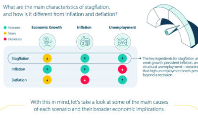
A Visual Guide to Stagflation, Inflation, and Deflation
-
 Markets in a Minute1 year ago
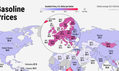
Mapped: Global Energy Prices, by Country in 2022
-
 Infographics3 years ago
The 5 Fastest Growing Industries of the Next Decade
-
 Markets in a Minute2 years ago
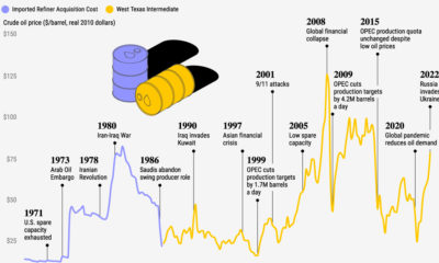
Visualizing Historical Oil Prices (1968-2022)
-
 Infographics1 year ago
Visual Guide: The Three Types of Economic Indicators