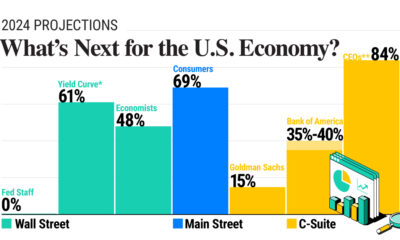

In this graphic, we show U.S. economic forecasts across Wall Street, Main Street, and C-Suite amid mixed signals in the economy.
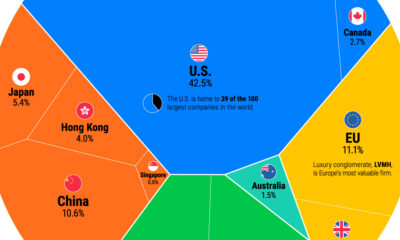

We show the entire global stock market in 2023, illustrating the dominance of U.S. markets. But as structural dynamics shift, will this last?
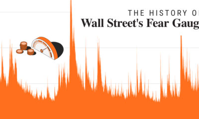

In 2023, market volatility has fallen dramatically. In this graphic, we show how it compares to historical trends.
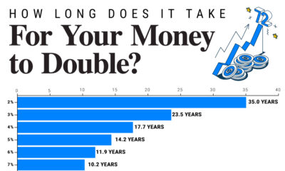

Since 1949, the S&P 500 has doubled in value 10 times. We show how long it takes to double your money across a range of annualized...
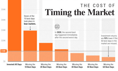

In this graphic, we show why timing the market is extremely difficult, and how it can meaningfully dent portfolio returns.
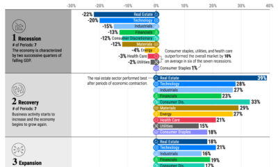

We show the best performing S&P 500 sectors over each phase of the business cycle using nearly seven decades of data.
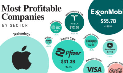

From Apple to Home Depot, we show America’s most profitable companies in their sector at a time of elevated inflation.
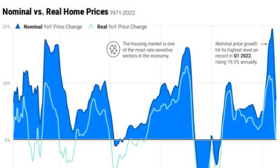

Home price growth has moderated amid rising interest rates and a narrow housing supply. Here's how prices compare to historical trends.
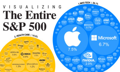

S&P 500 companies make up $34 trillion in market value combined. This graphic shows how they break down by weight and sector.
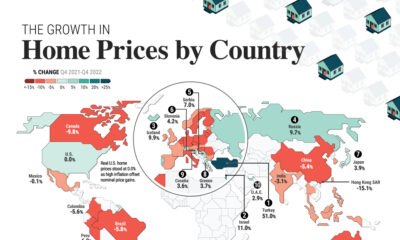

Global house prices were resilient in 2022, rising 6%. We compare nominal and real price growth by country as interest rates surged.