Markets in a Minute
Visualizing Asset Class Correlation Over 25 Years (1996-2020)
This infographic is available as a poster.
This infographic is available as a poster.
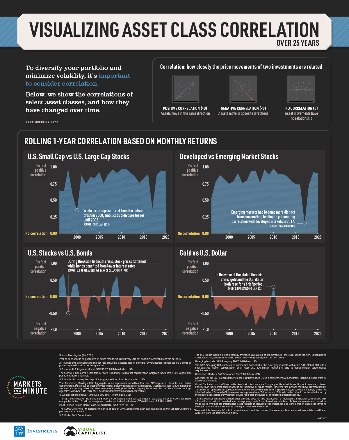
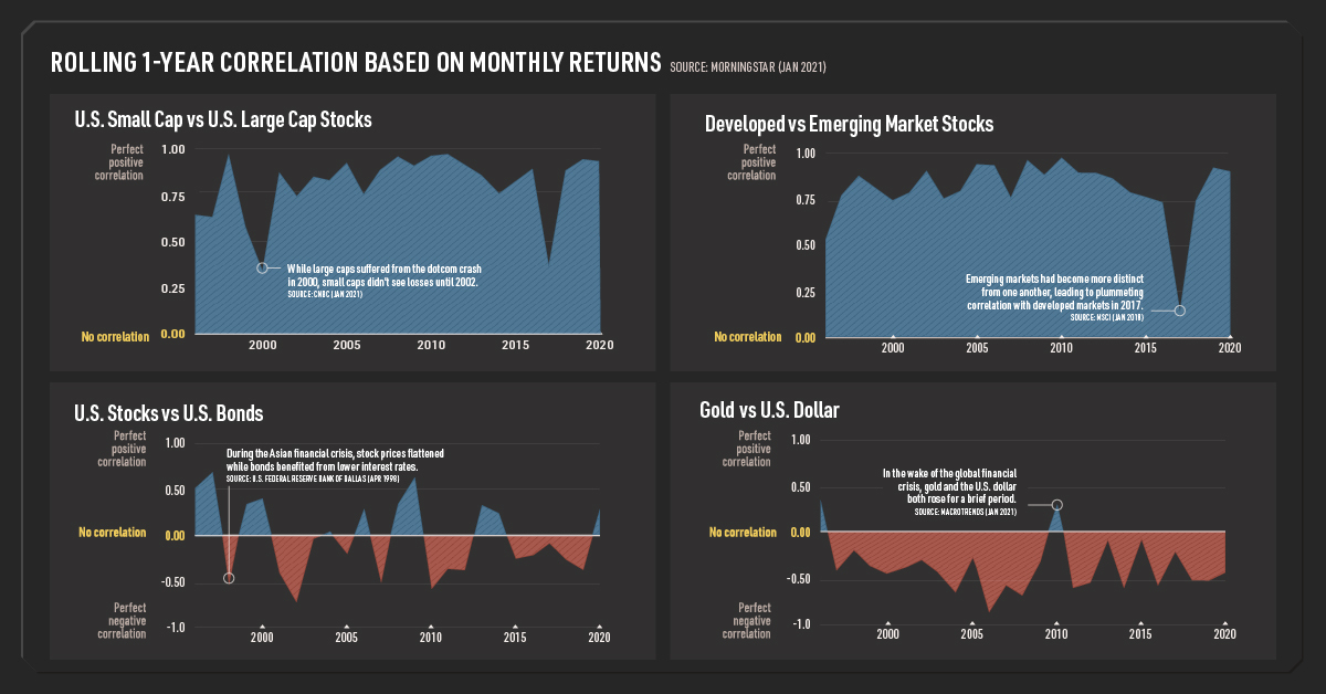
Asset Class Correlation Over 25 Years
How can you minimize the impact of a market crash on your portfolio? One main strategy is building a portfolio with asset classes that have low or negative correlation.
However, the correlation between asset classes can change depending on macroeconomic factors. In this Markets in a Minute from New York Life Investments, we show the correlation of select asset classes and how they have shifted over time.
What is Correlation?
Correlation measures how closely the price movement of two asset classes are related. For example, consider asset class A and B.
- If asset class A rises 10% and asset class B also rises 10%, they have a perfect positive correlation of 1.
- If asset class A rises 10% and asset class B doesn’t move at all, they have no correlation.
- If asset class A drops 10% and asset class B rises 10%, they have a perfect negative correlation of -1.
When investors are building a portfolio, asset classes with negative correlation or no correlation are most desirable. This is because if one asset class drops during a market downturn, the other asset class will either rise or be unaffected.
Correlation Between Stock Categories
Stock categories have historically had some level of positive correlation. Here are the correlations for small and large cap stocks, as well as developed and emerging market stocks.
| U.S. Small Cap vs. U.S. Large Cap Stocks | Developed vs. Emerging Market Stocks | |
|---|---|---|
| 1996 | 0.64 | 0.51 |
| 1997 | 0.63 | 0.76 |
| 1998 | 0.97 | 0.87 |
| 1999 | 0.58 | 0.80 |
| 2000 | 0.38 | 0.74 |
| 2001 | 0.87 | 0.78 |
| 2002 | 0.73 | 0.90 |
| 2003 | 0.85 | 0.75 |
| 2004 | 0.83 | 0.79 |
| 2005 | 0.93 | 0.93 |
| 2006 | 0.75 | 0.93 |
| 2007 | 0.89 | 0.75 |
| 2008 | 0.96 | 0.95 |
| 2009 | 0.91 | 0.88 |
| 2010 | 0.96 | 0.97 |
| 2011 | 0.97 | 0.89 |
| 2012 | 0.91 | 0.89 |
| 2013 | 0.86 | 0.86 |
| 2014 | 0.75 | 0.78 |
| 2015 | 0.82 | 0.76 |
| 2016 | 0.89 | 0.73 |
| 2017 | 0.39 | 0.14 |
| 2018 | 0.88 | 0.73 |
| 2019 | 0.94 | 0.91 |
| 2020 | 0.93 | 0.89 |
| Min | 0.38 | 0.14 |
| Max | 0.97 | 0.97 |
Rolling 1-year correlations based on monthly returns.
When macroeconomic conditions are strong, the correlation between stock categories tends to be lower as investors focus on individual company prospects. However, when market volatility rises, stocks tend to become more correlated as investors move to safer assets.
This was the case in 1998, when small and large cap stocks reached a peak correlation of 0.97. Russia defaulted on its debt, and a highly-leveraged hedge fund called Long Term Capital Management (LTCM) faced its own defaults as a result. Many banks and pension funds were invested in LTCM, and the Federal Reserve bailed out the fund to avoid a bigger crisis.
Shortly thereafter, small and large cap stock correlation reached a low in 2000. The dotcom bubble initially burst among large cap stocks, impacting some of the world’s largest companies. Small cap stocks didn’t see losses until 2002.
For developed and emerging markets, correlation peaked in 2010 when many countries were recovering from the global financial crisis. On the other end of the scale, correlation plummeted to its lowest level in 2017. One reason is that emerging markets became more distinct from one another due to their varying political risk and sector makeup.
Bonds, Commodities, and Currencies
In contrast to stock categories, there are some asset class pairings that have provided a low or negative correlation. Here is historical correlation data for U.S. stocks and bonds, as well as gold and the U.S. dollar.
| U.S. Stocks vs. U.S. Bonds | Gold vs. U.S. Dollar | |
|---|---|---|
| 1996 | 0.51 | 0.29 |
| 1997 | 0.68 | -0.40 |
| 1998 | -0.41 | -0.19 |
| 1999 | 0.34 | -0.36 |
| 2000 | 0.40 | -0.44 |
| 2001 | -0.39 | -0.38 |
| 2002 | -0.72 | -0.30 |
| 2003 | -0.04 | -0.43 |
| 2004 | 0.04 | -0.65 |
| 2005 | -0.20 | -0.27 |
| 2006 | 0.28 | -0.86 |
| 2007 | -0.44 | -0.55 |
| 2008 | 0.34 | -0.67 |
| 2009 | 0.64 | -0.33 |
| 2010 | -0.58 | 0.29 |
| 2011 | -0.35 | -0.59 |
| 2012 | -0.37 | -0.53 |
| 2013 | 0.33 | -0.11 |
| 2014 | 0.24 | -0.60 |
| 2015 | -0.26 | -0.10 |
| 2016 | -0.21 | -0.58 |
| 2017 | -0.09 | -0.23 |
| 2018 | -0.26 | -0.51 |
| 2019 | -0.37 | -0.51 |
| 2020 | 0.29 | -0.43 |
| Min | -0.72 | -0.86 |
| Max | 0.68 | 0.29 |
Rolling 1-year correlations based on monthly returns.
Stocks and bonds generally have low correlation, with negative correlation in 14 of the last 25 years. Correlation tends to be highest during periods of high inflation expectations. On the flip side, correlation is typically lower during periods of low inflation expectations or high stock market volatility.
These factors contributed to negative correlation in 1998 during the Asian Financial Crisis. Stock prices flattened due to company trade relationships with Asian economies, while bonds benefited from lower rates and lower inflation. In 2002, high market volatility due to the dotcom bubble resulted in stocks and bonds reaching their most negative correlation.
Similarly, gold and the U.S. dollar generally move in opposite directions, with negative correlation in 23 of the last 25 years. When optimism in the U.S. economy is high, the U.S. dollar tends to rise. Conversely, when there are concerns about the U.S. economy or inflation, gold is considered a safe asset that holds its value.
In 2006, gold and the U.S. dollar reached their most negative correlation. As the beginnings of the subprime mortgage crisis appeared, investors piled into safe haven assets such as gold. In 2010, gold and the US dollar had a brief moment of positive correlation. Concerned about the European debt crisis, investors sought safe haven assets elsewhere, including both gold and the U.S. dollar.
Choosing Asset Classes
As investors think about which asset classes to include in their portfolios, it’s important to consider correlation. For instance, stock categories have historically been positively correlated. To diversify, investors may want to consider bonds and alternative assets such as gold.
In addition, macroeconomic events such as financial crises can have an impact on correlation, and investors may want to monitor these changes over time. Finally, considering the risk and return characteristics of various asset classes will allow investors to build a portfolio best suited to their needs.


Markets in a Minute
The Top 5 Reasons Clients Fire a Financial Advisor
Firing an advisor is often driven by more than cost and performance factors. Here are the top reasons clients ‘break up’ with their advisors.

The Top 5 Reasons Clients Fire a Financial Advisor
What drives investors to fire a financial advisor?
From saving for a down payment to planning for retirement, clients turn to advisors to guide them through life’s complex financial decisions. However, many of the key reasons for firing a financial advisor stem from emotional factors, and go beyond purely financial motivations.
We partnered with Morningstar to show the top reasons clients fire an advisor to provide insight on what’s driving investor behavior.
What Drives Firing Decisions?
Here are the top reasons clients terminated their advisor, based on a survey of 184 respondents:
| Reason for Firing | % of Respondents Citing This Reason | Type of Motivation |
|---|---|---|
| Quality of financial advice and services | 32% | Emotion-based reason |
| Quality of relationship | 21% | Emotion-based reason |
| Cost of services | 17% | Financial-based reason |
| Return performance | 11% | Financial-based reason |
| Comfort handling financial issues on their own | 10% | Emotion-based reason |
Numbers may not total 100 due to rounding. Respondents could select more than one answer.
Numbers may not total 100 due to rounding. Respondents could select more than one answer.
While firing an advisor is rare, many of the primary drivers behind firing decisions are also emotionally driven.
Often, advisors were fired due to the quality of the relationship. In many cases, this was due to an advisor not dedicating enough time to fully grasp their personal financial goals. Additionally, wealthier, and more financially literate clients are more likely to fire their advisors—highlighting the importance of understanding the client.
Key Takeaways
Given these driving factors, here are five ways that advisors can build a lasting relationship through recognizing their clients’ emotional needs:
- Understand your clients’ deeper goals
- Reach out proactively
- Act as a financial coach
- Keep clients updated
- Conduct goal-setting exercises on a regular basis
By communicating their value and setting expectations early, advisors can help prevent setbacks in their practice by adeptly recognizing the emotional motivators of their clients.
Markets in a Minute
The Top 5 Reasons Clients Hire a Financial Advisor
Here are the most common drivers for hiring a financial advisor, revealing that investor motivations go beyond just financial factors.

The Top 5 Reasons Clients Hire a Financial Advisor
What drives investors to hire a financial advisor?
From saving for a down payment to planning for retirement, clients turn to advisors to guide them through life’s complex financial decisions. However, many of the key reasons for hiring a financial advisor stem from emotional factors, and go beyond purely financial motivations.
We partnered with Morningstar to show the top reasons clients hire a financial advisor to provide insight on what’s driving investor behavior.
What Drives Hiring Decisions?
Here are the most common reasons for hiring an advisor, based on a survey of 312 respondents.
| Reason for Hiring | % of Respondents Citing This Reason | Type of Motivation |
|---|---|---|
| Specific goals or needs | 32% | Financial-based reason |
| Discomfort handling finances | 32% | Emotion-based reason |
| Behavioral coaching | 17% | Emotion-based reason |
| Recommended by family or friends | 12% | Emotion-based reason |
| Quality of relationship | 10% | Emotion-based reason |
Numbers may not total 100 due to rounding. Respondents could select more than one answer.
While financial factors played an important role in hiring decisions, emotional reasons made up the largest share of total responses.
This illustrates that clients place a high degree of importance on reaching specific goals or needs, and how an advisor communicates with them. Furthermore, clients seek out advisors for behavioral coaching to help them make informed decisions while staying the course.
Key Takeaways
With this in mind, here are five ways advisors can provide value to their clients and grow their practice:
- Address clients’ emotional needs early on
- Demonstrate how you can offer support
- Use ordinary language
- Provide education to help clients stay on track
- Acknowledge that these are issues we all face
By addressing emotional factors, advisors can more effectively help clients’ navigate intricate financial decisions and avoid common behavioral mistakes.

The Top 5 Reasons Clients Fire a Financial Advisor

The Top 5 Reasons Clients Hire a Financial Advisor

Visualizing the Growth of $100, by Asset Class

How Small Investments Make a Big Impact Over Time

What Were the Top Performing Investment Themes of 2023?
-
 Infographics2 years ago
The Top Investment Quotes Every Investor Should Know
-
 Markets in a Minute2 years ago
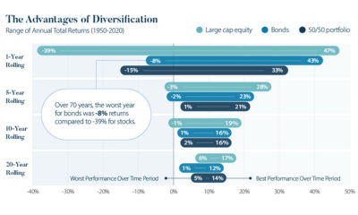
Mapped: The Growth in U.S. House Prices by State
-
 Markets in a Minute2 years ago
How Closely Related Are Historical Mortgage Rates and Housing Prices?
-
 Infographics2 years ago
A Visual Guide to Stagflation, Inflation, and Deflation
-
 Markets in a Minute1 year ago
Mapped: Global Energy Prices, by Country in 2022
-
 Markets in a Minute2 years ago
Visualizing Historical Oil Prices (1968-2022)
-
 Infographics1 year ago
Visual Guide: The Three Types of Economic Indicators
-
 Markets in a Minute2 years ago
Mapped: Global Macroeconomic Risk, by Country in 2022